Final Concept
Note: I couldn’t embed videos on this page, so my process videos are in this Google Drive folder: https://drive.google.com/drive/folders/1T3qsJq4pVoNUqj96f5aLVYbNuOmPWuFS?usp=sharing
Final Code: https://editor.p5js.org/sa8831/sketches/T_5rJRFni
I was inspired by album covers by artists like Ptasinski and RJ Pasin, which use thin linework, mirrored symmetry, sparkles, and dotted chains. I was drawn to this style, so I compared it with my childhood drawings to see what I could make from it. My childhood drawings look nothing like those covers, since mine are round and colorful. But they have things in common: I always drew a main shape and surrounded it with smaller marks like dots, stars, and outlines, and some of my pages used zigzags and shards. I decided to turn that way of drawing into rules in p5.js.
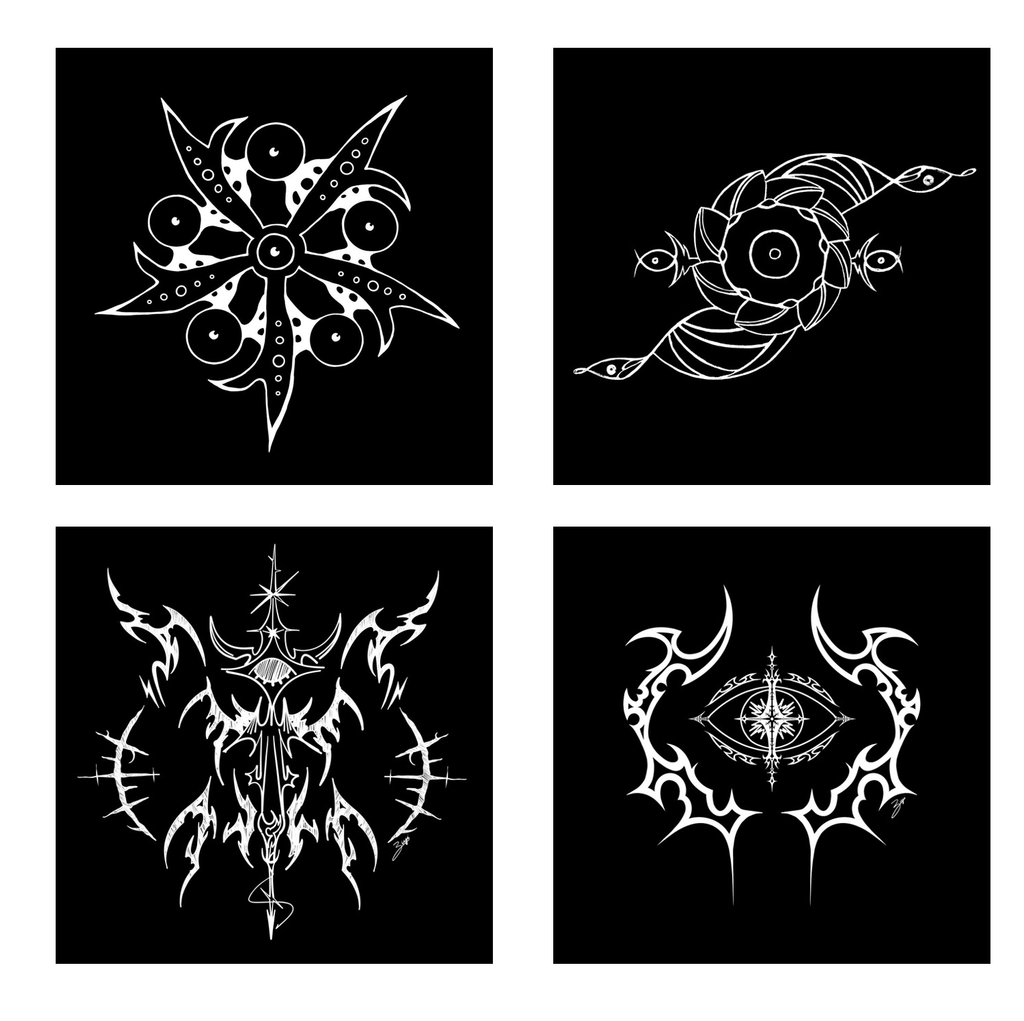
Figure 1: Top Left, Bottom Left, and Bottom Right are album covers by Ptasinski, while Top Right is an Album cover by RJ Pasin
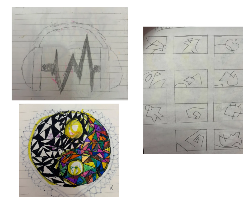
Figure 2: Old drawings from 2016-2018
Initial Brainstorming
While brainstorming, I started with EKG traces and heavy metal logos and thought of combining them, since the most common thing between them was sharp spikes shooting up and down from a single line. I wasn’t sure which one to build on, so I tested a few versions in p5.js and dropped them.
Initial References:
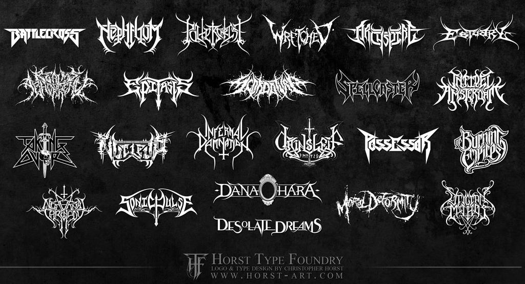
Figure 3: Heavy Metal Band Logos References (Source: https://imodesign.wordpress.com/2012/11/05/heavy-metal-logos/?utm_source=Pinterest&utm_medium=organic)
In the first versions tested on p5 (See below), each row is one straight line, and a small spike shape pushes the line up at random spots. The rows are stacked, and in the second version I cut them into a diamond. It looked too much like Unknown Pleasures by Joy Division, so I changed that idea and landed on the final concept
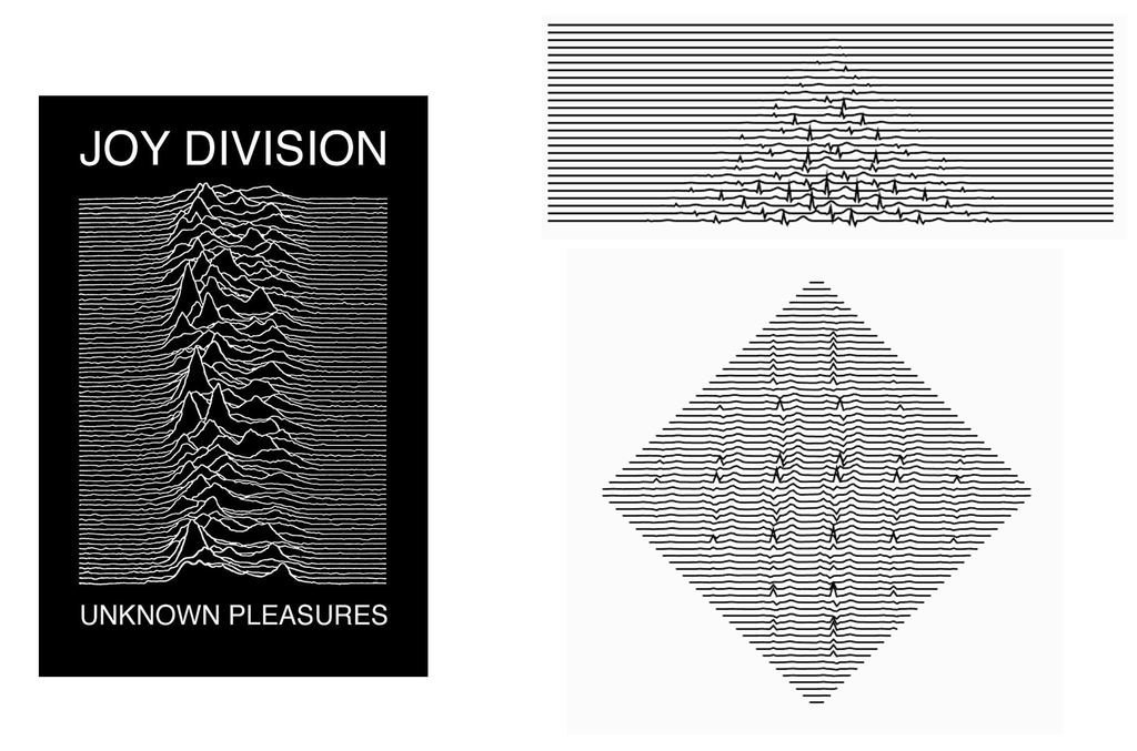
Figure 4: Left side is Unknown Pleasures, Right Side is code outputs
Workflow
I designed the drawings in p5.js. A seed number picks one of three forms (a vertical totem, a radial burst, or a bending vine) and all the rules, like strand count and branching chance. Each form is built around a main line, and the code picks random spots along that line to grow from, with a minimum gap so they don’t pile up. At each spot it grows two mirrored curved arms made of nested strands. The strands are pushed sideways into sharp spikes, and every spike can sprout a smaller arm through a function that calls itself, capped at 400 branches.
if (t > .1 && budget < 400 && roll < bProb * (1 - .5 * t)) {
  budget++;                       // count it, stop at 400
  let p = pts[idx];               // the spike's position
  branch(p.x, p.y, atan2(p.dy, p.dx) + ou * ang, cc, len * lf, gen + 1, side, nd);
}
Every line is stored in a paths list. For the drawings I plotted, the lines were sorted so the pen travels less and written out as an SVG with exportSVG(). The linked code saves the same lines with the p5.js-svg library instead, which keeps the order the sketch draws them in. I then opened the SVG in Inkscape and generated the G-code. The G-code came out much too big for the paper, because the tool seemed to read pixels as millimeters, so I shrank the drawing and checked its size in the G-code viewer before plotting. Then I taped the paper down, did a dry run with no pen, and plotted.
I based the rules of my code on the drawing habits I developed as a kid. I always drew a main shape with smaller marks around it, like dots and stars. In the code, this is a main line with arms growing from it, with sparkles along the arms and dotted chains at their tips. For outlines, each arm is drawn as several parallel copies of itself, which are the nested strands. For zigzags and shards, the function spike() makes each spike by adding five bumps together: one tall bump that is the spike, with small dips and bumps on either side. Each spike can also grow a smaller arm. For the mirrored symmetry of the album covers, both arms at each spot get the same random numbers, so the two arms come out identical.
Typing a number into the seedline at the top of the sketch locks a drawing, so the same number always gives the same drawing.
The Three Forms
I added a rule that makes each drawing one of three forms, chosen by the seed. I used three because a main line can only stay straight, spread out from one point, or bend. Each one changes the layout of the whole drawing while the arms, spikes, and sparkles stay the same. The totem is one vertical line down the middle, with 5 to 18 growth spots along it. Its arms and the smaller arms sprouting from them can also drip downward by a random amount.
The burst is 5 to 10 straight lines going out from the center like spokes, each with 3 to 7 growth spots. Its arms are shorter than the totem’s, and it is the only form with a large sparkle at the center.
The vine is one line that bends from side to side, starting near the bottom of the page. Its direction follows a sine wave, so no two vines curve the same way. It has 6 to 16 growth spots, and its arms are medium length.
Process and Challenges
I plotted 8 trials, changing the pen, paper, layering, or workflow each time, and picked the 3 strongest (Trials 6, 7, and 8) as my final series.
G-Code straight from p5.js:
The assignment allowed exporting G-code directly from p5.js, so I wondered why the workflow usually goes through SVG and Inkscape. I was curious what would happen if I skipped that step, so I tried the direct route for two trials, with two different forms (a burst in Trial 1 and a totem in Trial 2). I didn’t know what the consequences would be. The G-code that p5.js exports uses different commands and settings from what my plotter and Universal G-code Sender expect, and the pen never lifted in either trial.
This is the export function I added to the sketch for Trials 1 and 2:
const SCALE = 0.9;
const AREA_W = 280, AREA_H = 260;      // paper or safe area in mm
const PEN_UP   = "G0 Z5";
const PEN_DOWN = "G1 Z0 F500";
const DRAW_F = 3000, TRAVEL_F = 6000;  // mm/min
const FLIP_Y = true;

function exportGcode() {
  const OX = (AREA_W - W * SCALE) / 2;
  const OY = (AREA_H - H * SCALE) / 2;
  const X = x => (x * SCALE + OX).toFixed(2);
  const Y = y => ((FLIP_Y ? H - y : y) * SCALE + OY).toFixed(2);

  let L = ["; sigil | form: " + form + " | seed: " + seed + " | scale: " + SCALE,
           "G21 ; mm", "G90 ; absolute", PEN_UP];
  for (let pa of sortPaths()) {
    L.push("G0 X" + X(pa[0][0]) + " Y" + Y(pa[0][1]) + " F" + TRAVEL_F);
    L.push(PEN_DOWN);
    for (let i = 1; i < pa.length; i++) L.push("G1 X" + X(pa[i][0]) + " Y" + Y(pa[i][1]) + " F" + DRAW_F);
    L.push(PEN_UP);
  }
  L.push("G0 X" + X(0) + " Y" + Y(H) + " ; park", "M2");
  saveStrings(L, "sigil_" + seed + "_s" + SCALE, "gcode");
}
Trial 1:
Form: burst
I used a purple fine tip on textured A3 test paper (not thick). The paper already had some lines and a dark blob at the top right before I plotted, so I took that into account while testing. The lines came out crisp, but the pen never lifted, so it drew long straight lines between every piece and covered the page in them.
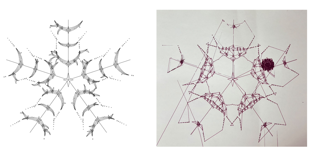
Video Clips:
Trial 2
Form: Totem
I used a black gel pen on normal A3 paper. The pen again never lifted, so long lines ran across the page and down the left edge. Partway through, I switched to exporting an SVG and generating the G-code in Inkscape, and the pen started lifting and lowering correctly. Because I changed files mid-plot, some parts were drawn twice, so some lines look repeated. The nested strands and sparkles are clean, but some lines and dotted chains look faint or broken into dashes. I first thought the pen had run out of ink, but when I paused the plot in Universal G-code Sender and checked it, it still wrote smoothly. My guess is pen positioning: the more the holder lifts and lowers, the more the pen tilts and stops holding still.
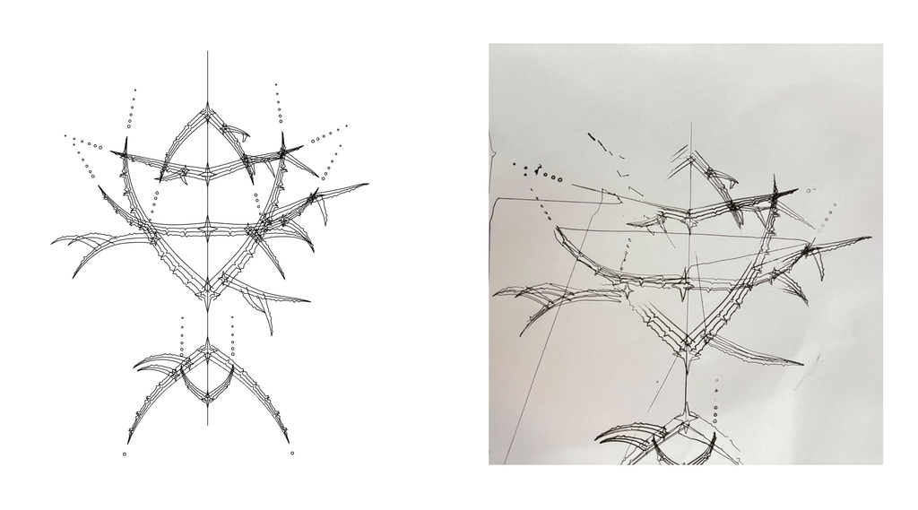
Video Clips:
After these two trials, I went back to SVG → Inkscape → G-code for everything else. The Inkscape settings fixed the main problem: the pen lifts and lowers when it should.
From p5.js to SVG (Inkscape):
Trial 3
Form: Totem
I placed the drawing too close to the edge of the page, so the pen went off the paper and part of the drawing didn’t land on it. In Inkscape, the closer a drawing sits to the edge of the Laser G-code border, the less of it gets plotted. This made me think about where a drawing should sit on the page. The pen lifted well, but partway through it stopped touching the paper, so I paused the plot and adjusted it by hand. That fixed most of it, but in other spots the pen lowered and still didn’t mark, so some lines are broken or missing.
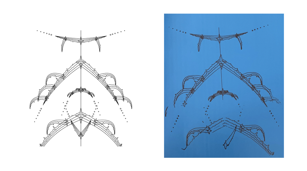
Video Clips:
Trial 4
Form: Vine
I used a blue gel pen on normal A4 paper. The sparkles and dotted chains came out clean, but parts of some lines looked faint or dashed, as if the pen had skipped. The ink ran out partway through, which made some strokes jagged, and the pen shifted around in the holder, so lines weren’t consistently crisp. To fix the shifting, I packed paper into the holder to wedge the pen in place, which helped somewhat.
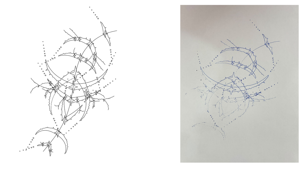
Trial 5
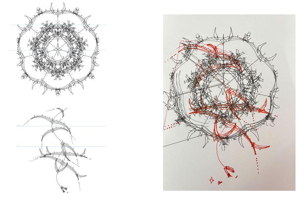
Forms: Burst (black) and Vine (red)
I made two different designs, a burst for the black gel pen and a vine for the red Sharpie, and exported each as its own SVG. I plotted them one after the other on A4. The red layer didn’t line up with the black, and there were stray lines outside the main shape. With the pen set too low, it dragged across the paper during travel moves even when the plotter “lifted” it, which happened with the red pen too. Raising the pen height helped. The red also doesn’t stand out as much as the black, probably because the black layer is much denser and the red is sparse. This taught me that layers need the same position and size, and that the paper can’t move between passes.
Video Clips:
Trial 6
Form: Totem
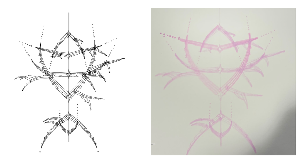
I used pink brush paint markers on thick sketchbook paper. Mechanically, this was the smoothest trial, and the pen lifted and lowered well. The marker itself was very streaky, which left dense patches, merged the nested strands into wide bands, and blunted the spikes. Line width varied across the drawing even though the height was fixed. When I did adjust the height slightly, it changed the pressure on the paper and thickened some areas further. I kept it for its soft, mirrored look.
Video Clips:
First Clip
Trial 7
Forms: Totem and Vine
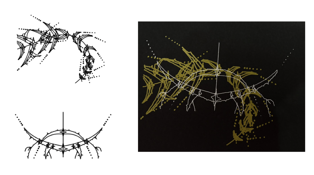
I used a blue Sharpie on normal A4. This one had the fewest problems. The center merged into a dark knot where lines crowded together, while the outer arms stayed crisp. The one flaw is a loose thread of ink at the top left. The pen shook during the plot, so I had to readjust the paper packing in the holder, and the shaking caused the thread. I kept it for its sparse, radial look.
Video Clips:
Trial 8
Form: Burst
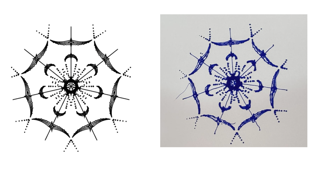
I used a blue Sharpie on normal A4. This one had the fewest problems. The center merged into a dark knot where lines crowded together, while the outer horns stayed crisp. The one flaw is a loose thread of ink at the top left. The pen shook during the plot, so I had to readjust the paper packing in the holder, and the shaking caused the thread. I kept it for its sparse, radial look.
Final Results
All three finals come from the same drawing system and are built from spikes, nested strands, sparkles, and dotted chains. The seed gave each one a different form (pink: totem, gold and silver: combination of totem and vine, blue: burst), and the pen and paper changed how the lines look. The pink one is soft and mirrored, the gold and silver one is dense and asymmetric, and the blue one is sparse and radial.
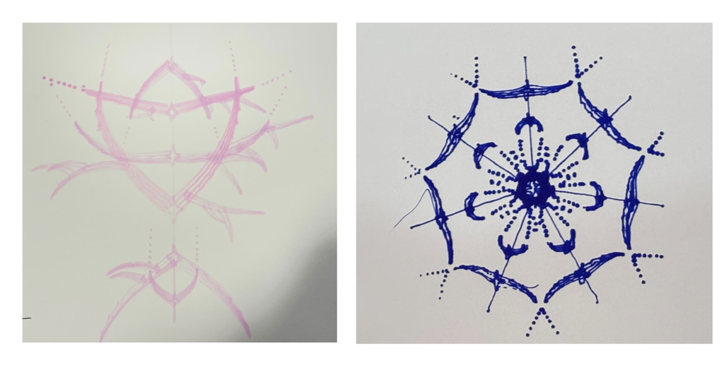
Left, Trial 6: pink brush paint markers on thick sketchbook paper (Totem, seed number (27854)). Right, Trial 8: blue Sharpie on normal A4 (Burst, seed (3613)).
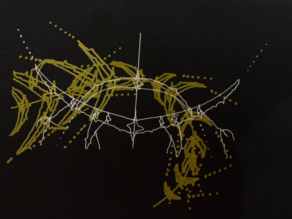
Trial 7: gold marker and silver gel pen on black paper, two layers. Totem and vine, seeds (40027) and (66934). The thick gold and thin silver cross at the sparkles, and the contrast between them makes it work.
Reflection
Materials changed the drawing more than I expected. The drawing rules were the same in each case, but the ink decided how the lines read. The pink brush marker on sketchbook paper spread the nested strands into wide bands and blunted the spikes, which gave the first design its soft look. On black paper, the thick gold marker made a dense, streaky buildup, while the silver gel pen stayed thin and crisp, and that contrast is what makes the design work. The blue Sharpie made the outer arms stay crisp, though the center merged into a dark knot where the lines crowded together.
Layering and color depended on contrast. In Trial 5, the sparse red over the dense black got lost, and the layers didn’t line up. I learned they need the same position and size, and the paper can’t move between passes. In Trial 7 I aligned both designs in Inkscape first, and the thick gold with thin silver on black read clearly. Red on blue (Trial 3) had low contrast, while light metallic on black was clear. Contrast in value mattered more than the hue.
Pen stability and height affected every final. When the pen sat too low, it dragged during travel moves, and when it shook in the holder, it left stray marks. The loose thread at the top left of the blue Sharpie drawing came from that shaking. Packing paper into the pen holder helped, but I had to readjust it between plots. Adjusting the height also changed the pressure on the paper, which thickened some areas of the first design. In the future I’d try other ways to hold the pen in the plotter (such as a longer screw, or a flat 3D-printed piece that pushes the pen in and holds it firmly), which should keep pressure consistent without constant manual adjustment.