1. Concept and Inspiration
How much control do we really have over the process of becoming who we are?
For this project, I wanted to create a series of patterns that were visually interesting but also had a meaning behind them. I’ve always liked floral patterns and mandalas, especially how repeating simple shapes can create something much more detailed.
While experimenting with different patterns in p5.js, I started thinking about how repetition and change could relate to personal growth. We all have certain routines, plans, and expectations, but things don’t always happen the way we imagine. Different experiences can change our direction and shape who we become.
That’s where the idea for Patterns of Becoming came from. I decided to create three drawings, each representing a different part of that process.
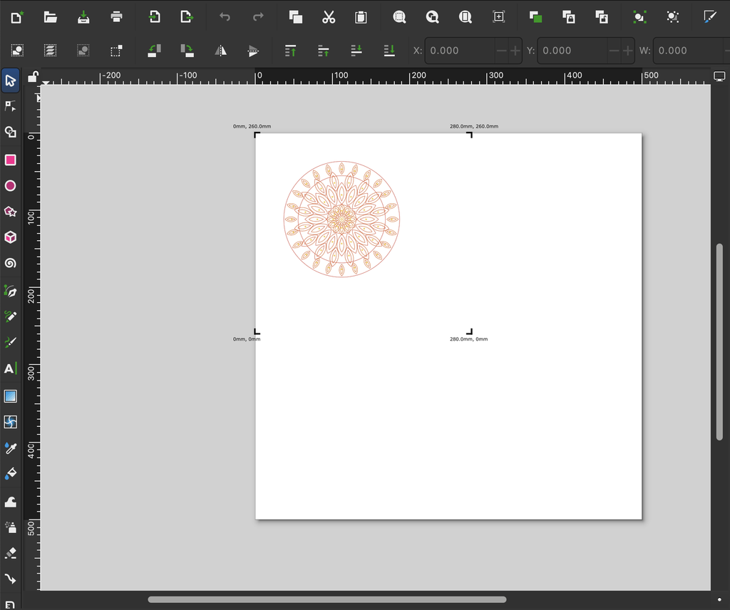
- Balance represents stability and the sense of control we try to maintain. Its symmetrical arrangement reflects order and consistency.
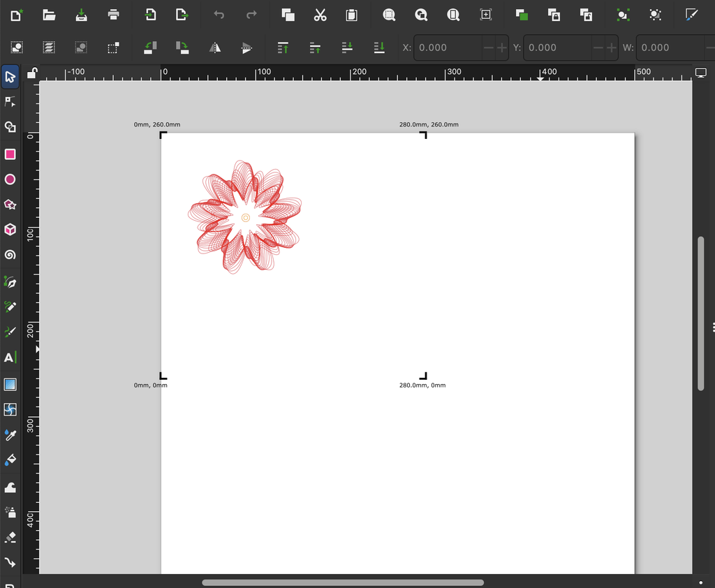
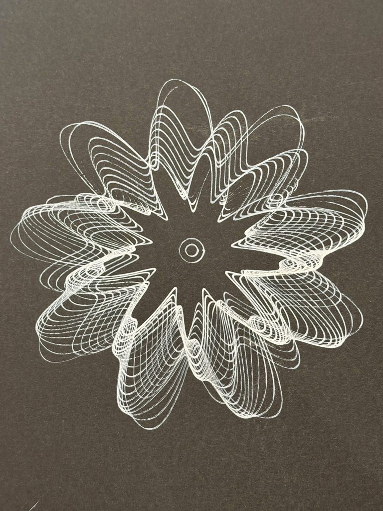
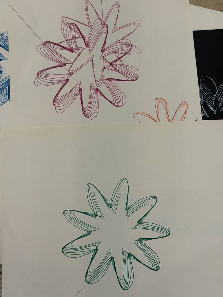
- Transformation represents change and how different experiences can overlap and influence one another. The intersecting curves create a more complicated pattern, even though they follow mathematical rules.
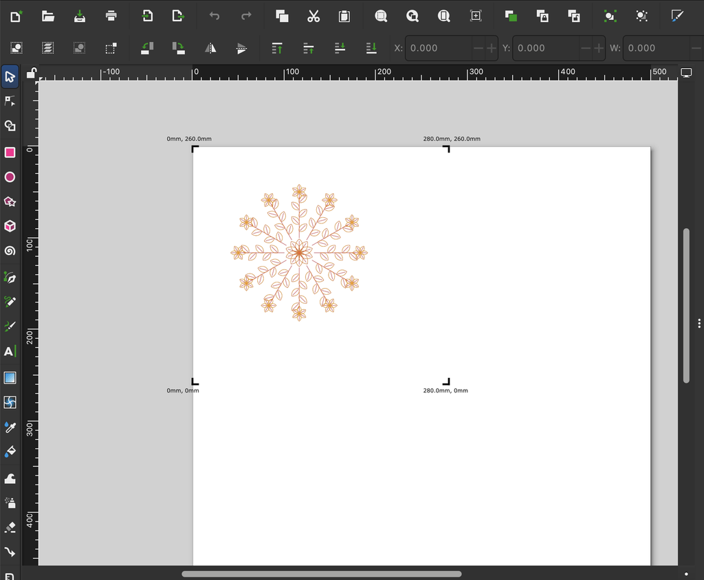
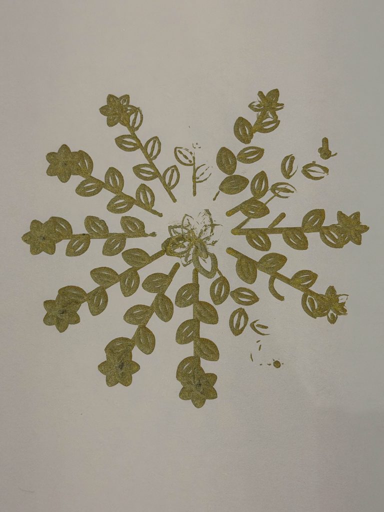
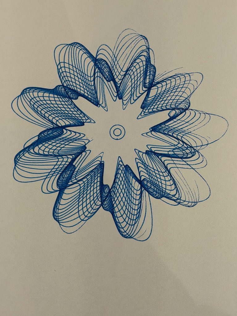
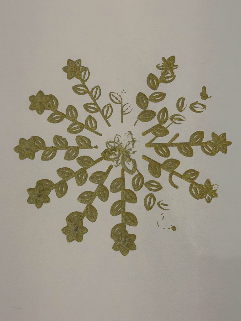
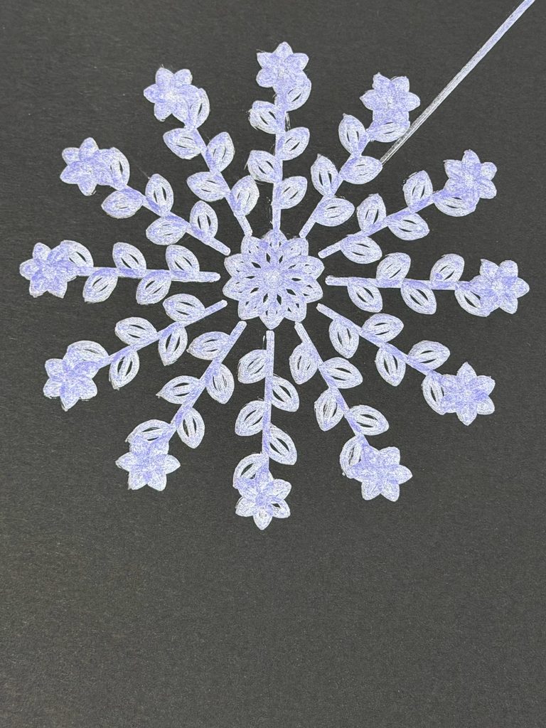
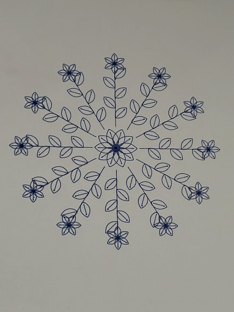
- Growth represents moving forward and developing in new directions. The repeated leaves and branches extend outward from a shared center, almost like a plant continuing to grow.
What interested me was that all three drawings follow specific rules, yet each produces a completely different result. I liked how this connected to my original question. We can have plans and routines that give our lives structure, but we can’t always predict how things will turn out.
I also wanted to explore this idea through the pen plotter, where even a carefully planned digital drawing might turn out differently once it’s drawn on paper.
Visual Inspiration
For Balance, I was inspired by the symmetry of lotus flowers and mandala patterns, especially how petals repeat around a central point. I came across Kathy Klein’s flower mandalas, where she arranges natural materials into detailed circular patterns. I liked how she used repetition and symmetry to create something visually balanced, which connected to the direction I wanted to take with my first drawing.
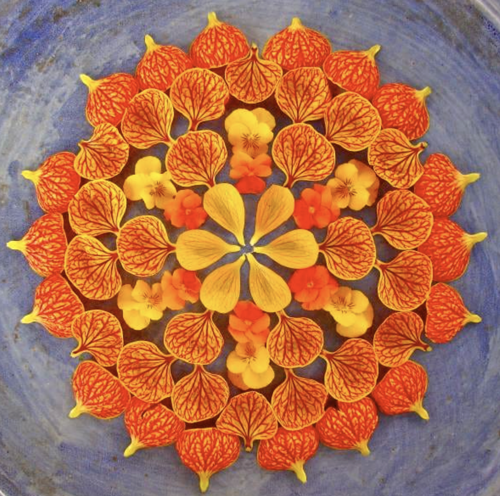
Figure 1. Kathy Klein, Flower Mandalas. Source: Garden Design.
For Transformation, I was interested in Spirograph and harmonograph drawings, particularly how mathematical movements create overlapping curves. I found Anita Chowdry’s Harmonograph Project (2013), where she uses a pendulum-based drawing machine to create intricate patterns. I liked how the repeated movements produced complex overlapping lines, which reminded me of the mathematical curves in my own design.
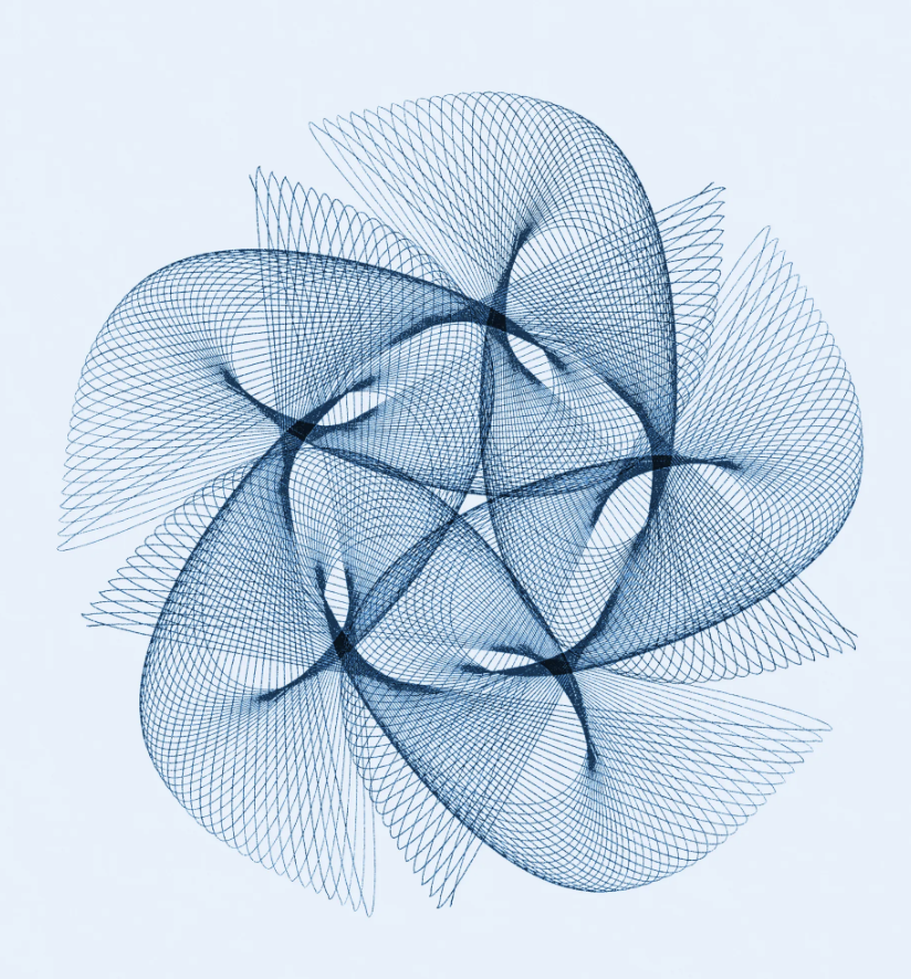
Figure 2. Anita Chowdry, Harmonograph Project (2013). Source: Artist’s Website.
For Growth, I looked at botanical patterns, especially how leaves and flowers repeat along branches. William Morris’s Acanthus wallpaper caught my attention because of its flowing leaves and repeated plant forms. Although my drawing is more geometric, I liked how the botanical shapes extend and connect to create a larger composition.
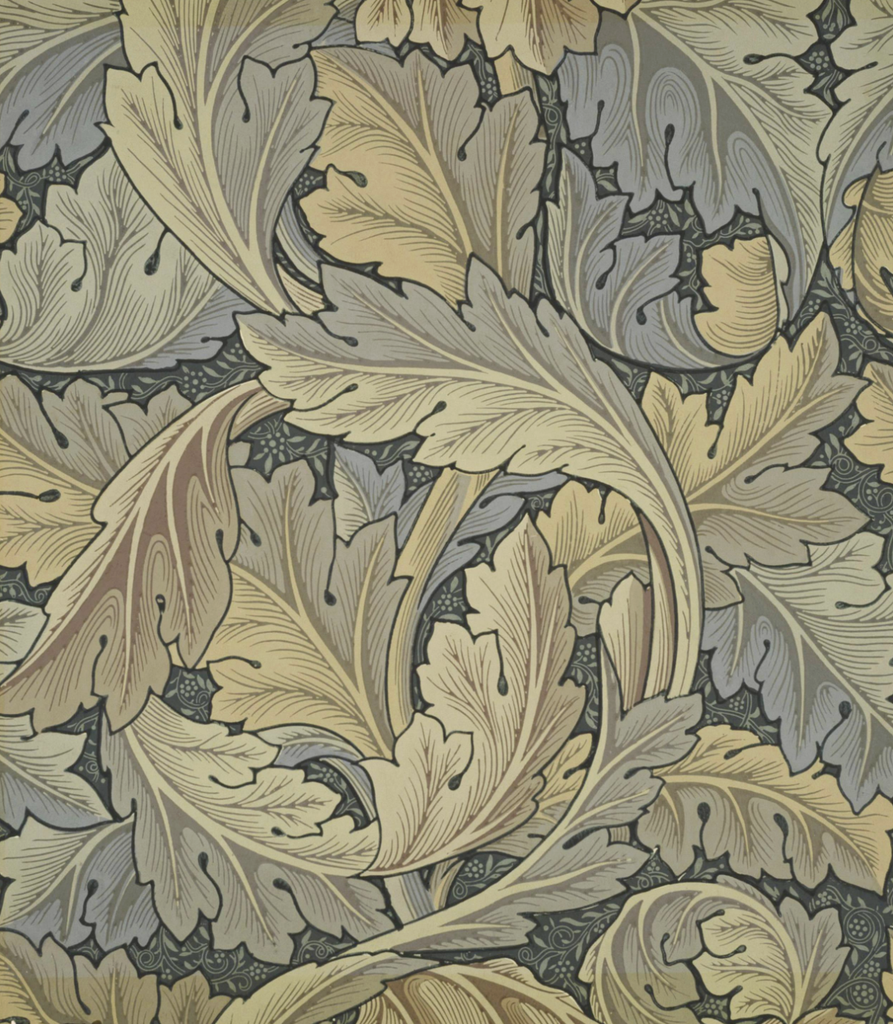
Figure 3. William Morris, Acanthus wallpaper (designed 1874). Source: William Morris Gallery.
These artworks helped me explore different ways of using repetition in my designs. Rather than copying their patterns, I used them as visual references while developing my own algorithms.
2. Developing the Algorithms
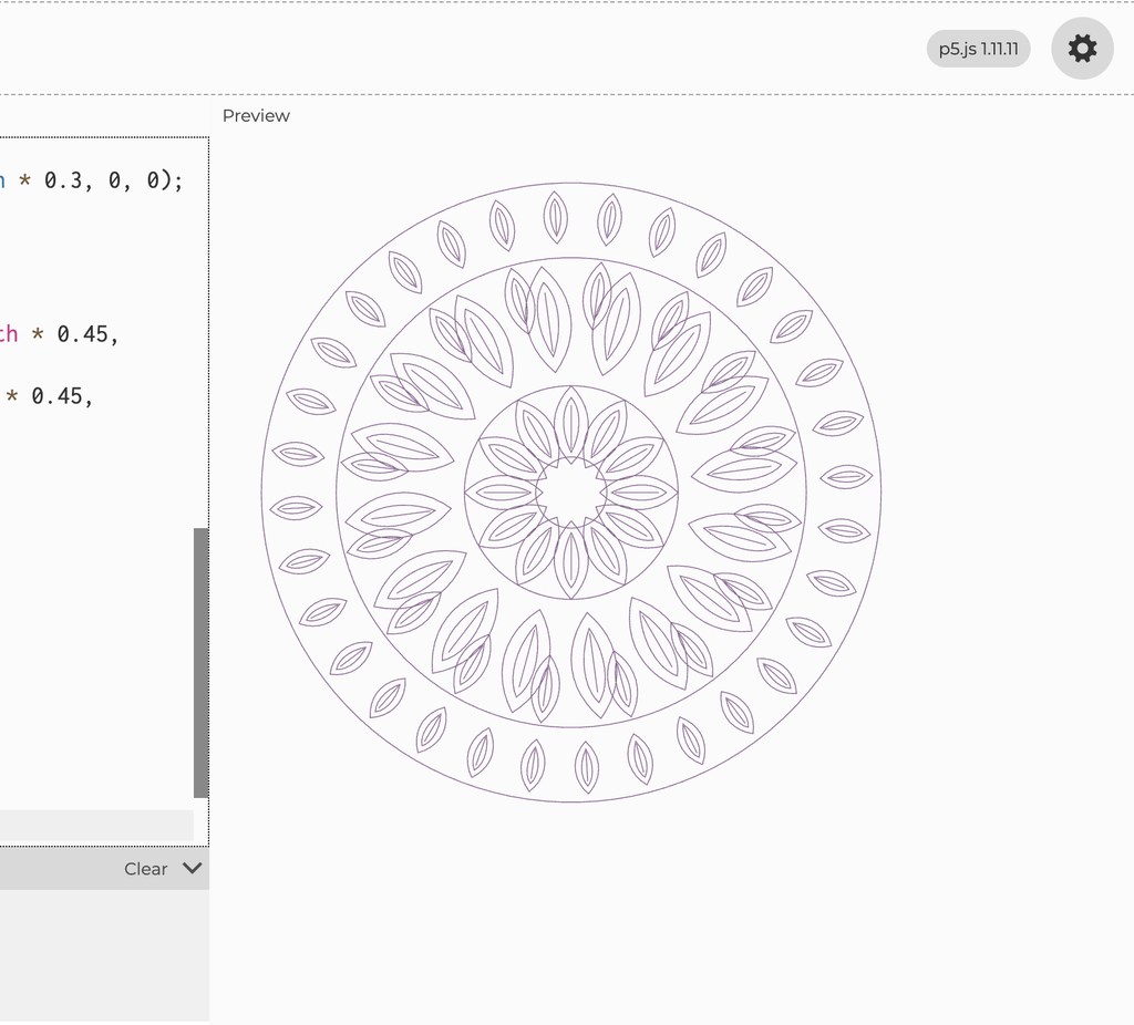
I created my drawings in p5.js using a 500 × 500 canvas and the SVG renderer. Throughout the project, I experimented with different shapes, repetition, rotation, and mathematical functions. My ideas changed quite a bit from what I originally planned, and I didn’t immediately know what I wanted my final series to look like.
Initial Experiment: Butterfly Pattern
My first idea was actually to create a butterfly-inspired pattern. I liked butterflies because they are often associated with transformation and change.
I started experimenting with this idea in p5.js, but after seeing the digital result, I felt that the drawing was too simple. I also wasn’t completely satisfied with the concept because I wanted to explore something beyond the usual idea of a butterfly representing transformation.
Although I decided not to continue with this design, it helped me realize that I wanted to explore patterns that could develop through repetition and variation.
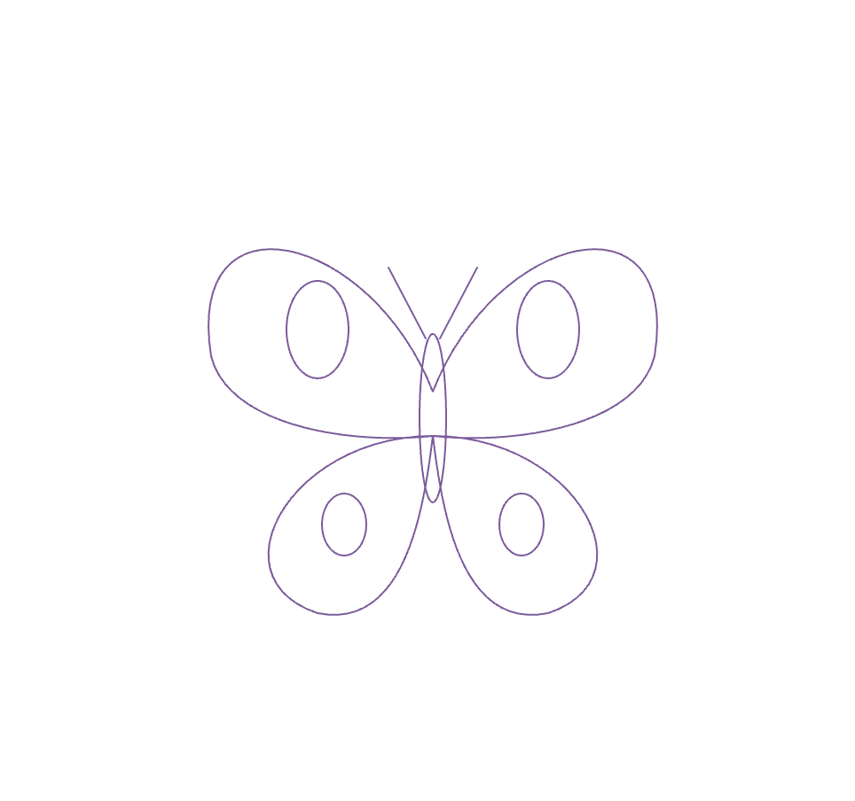
Second Experiment: Lotus Pattern
After moving away from the butterfly idea, I started experimenting with lotus flowers and mandalas. I’ve always liked floral patterns, and I thought they would give me more opportunities to explore symmetry and repetition.
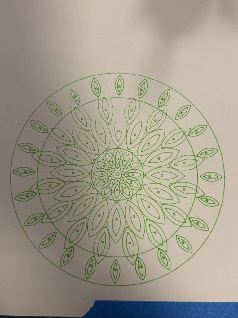
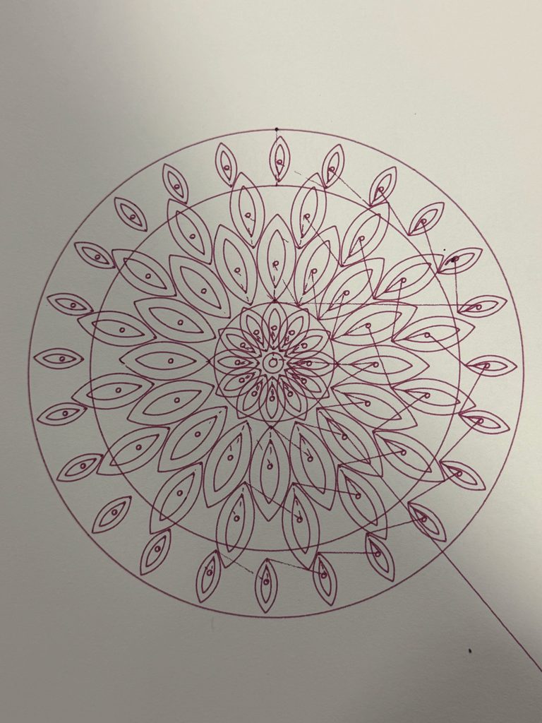
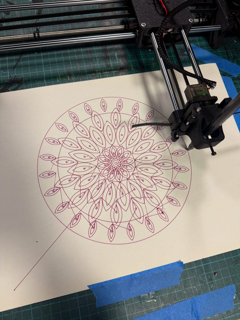
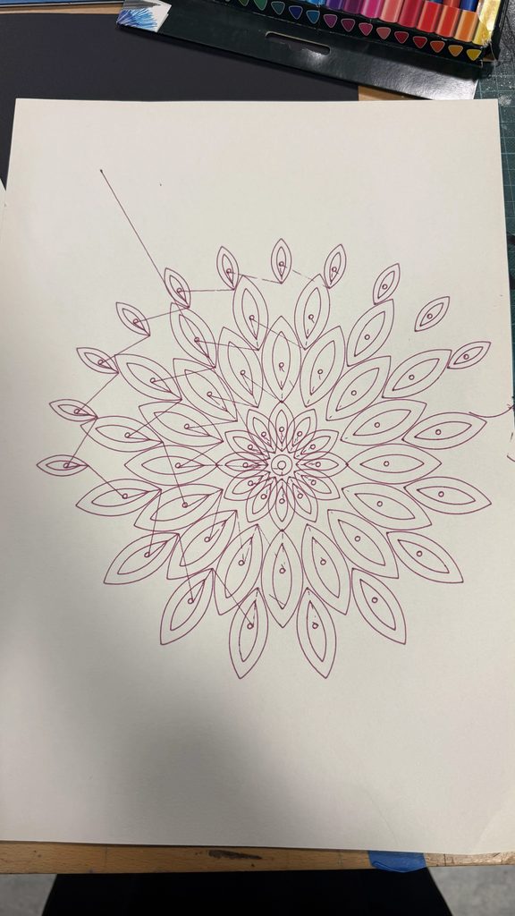
I created a function called lotusPetal() using Bézier curves and repeated the petals around a central point. I experimented with different sizes, positions, and layers, and tested the design using purple and green pens on the pen plotter.
Although I liked how the drawing turned out, I felt that some of the layers looked too similar. I wanted the pattern to have more variation while keeping its symmetry.
Instead of keeping this as my final drawing, I decided to revise the algorithm and develop a more detailed version.
Further Mandala Experiments
After receiving feedback, I went back to my three drawing algorithms and created six additional experiments. Instead of only changing pens and colors, I wanted to see how changing the code itself would affect the drawings. I tested two different versions of each pattern and compared them with my final designs.
I wanted to compare a simpler version with fewer petals and layers against a denser version with more repeated shapes. This would help me understand whether adding detail necessarily made the drawing more interesting, or whether it could make the pattern too crowded.
I also wanted to experiment with changing the rotation of certain layers to see how that affected the overall symmetry.
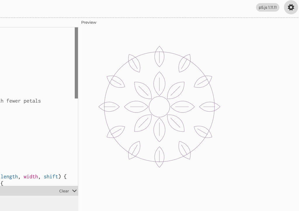
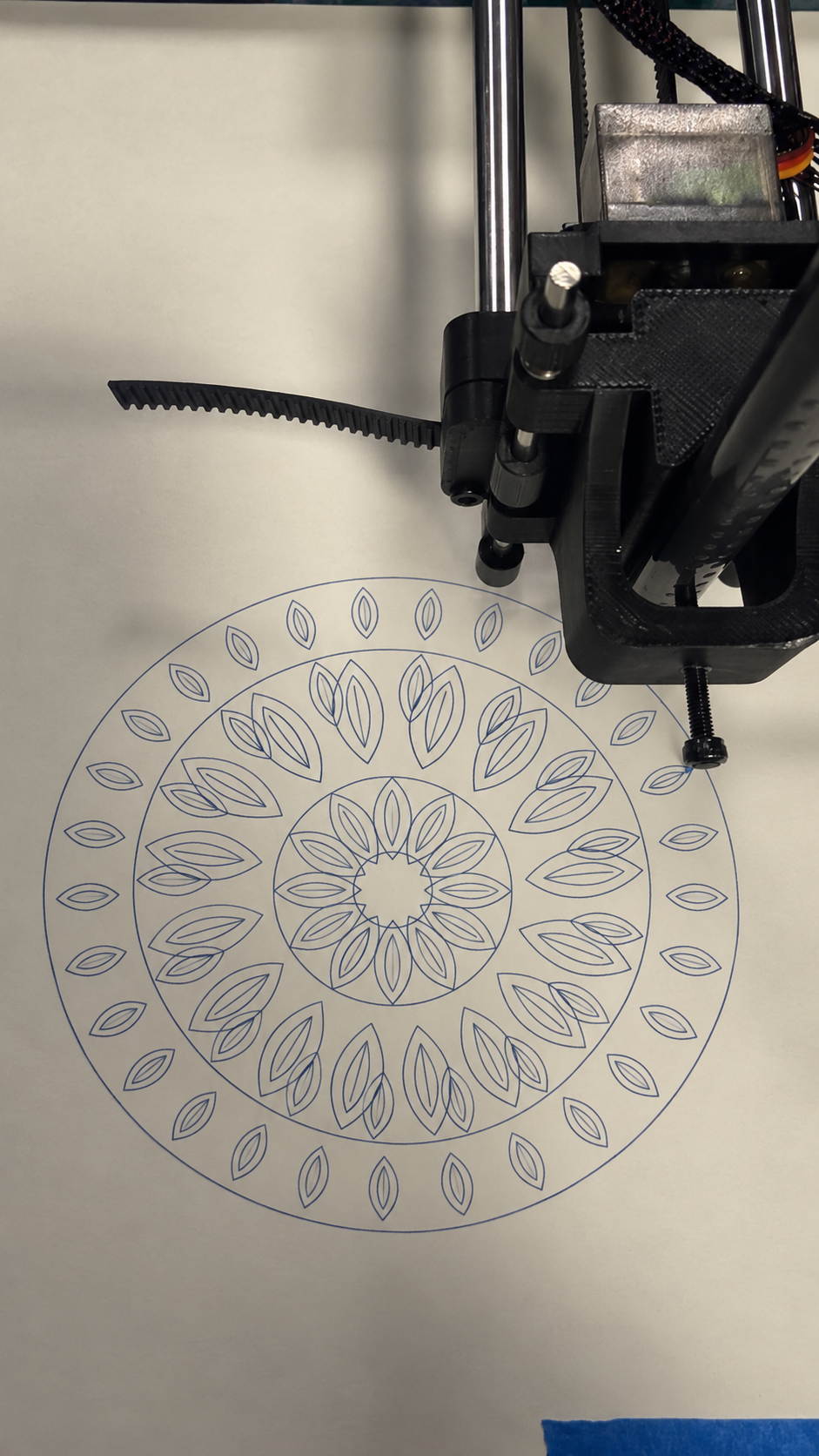
Experiment 1 – Simple Mandala
For my first experiment, I made the Balance drawing simpler by reducing the number of petal rings from four to two. I also used fewer petals to see how the drawing would look with less detail.
I plotted this version using a green pen. The petals were easier to see because there was less overlapping. However, I felt that the drawing looked a little too empty. I preferred my final Balance design because the extra layers made it look more complete.
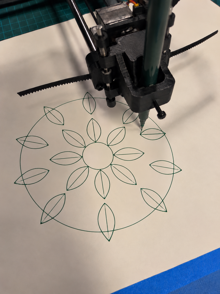
Experiment 2 – Shifted Mandala
For my second experiment, I changed the rotation of some of the petal layers to see how their positions would affect the pattern.
I plotted this version using a blue pen. I noticed that some petals overlapped more, especially in the middle. I found it interesting that changing just a few numbers in the code could make the drawing look different. However, I preferred my final Balance design because the petals were more evenly arranged.
What I learned
These experiments helped me see how small changes in the code can affect the final drawing. The simple version had more space between the petals, while the shifted version had more overlapping. I realized that I wanted my final Balance drawing to have enough detail without looking too crowded.
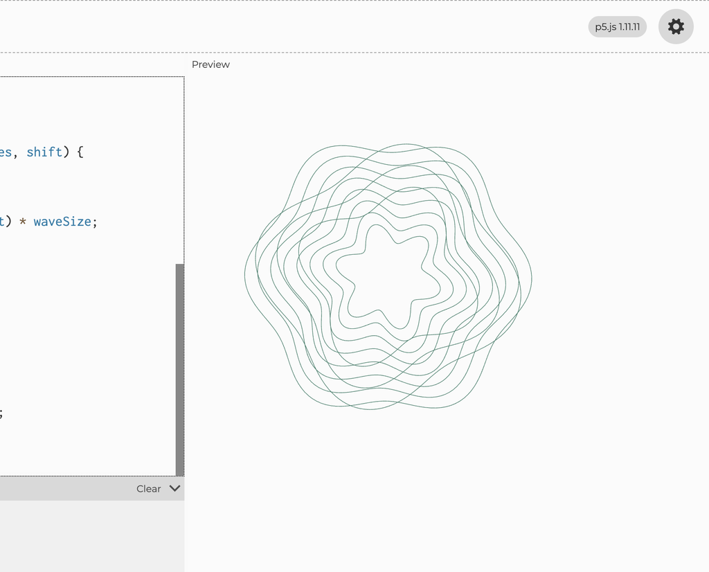
Experiment 3 – Simplified Transformation
For my first Transformation experiment, I reduced the number of wave layers to see how the drawing would look with fewer overlapping lines.
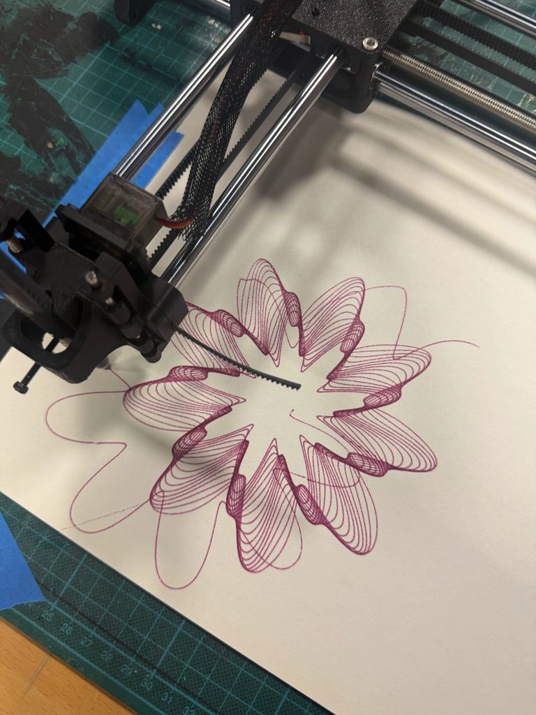
I plotted this version using a purple pen. I noticed that the individual curves were easier to see and there was more empty space between them. However, I felt that the drawing looked too simple compared to my final Transformation design. I preferred the final version because the extra layers made the pattern more detailed and interesting.
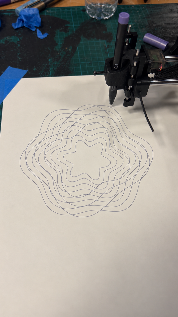
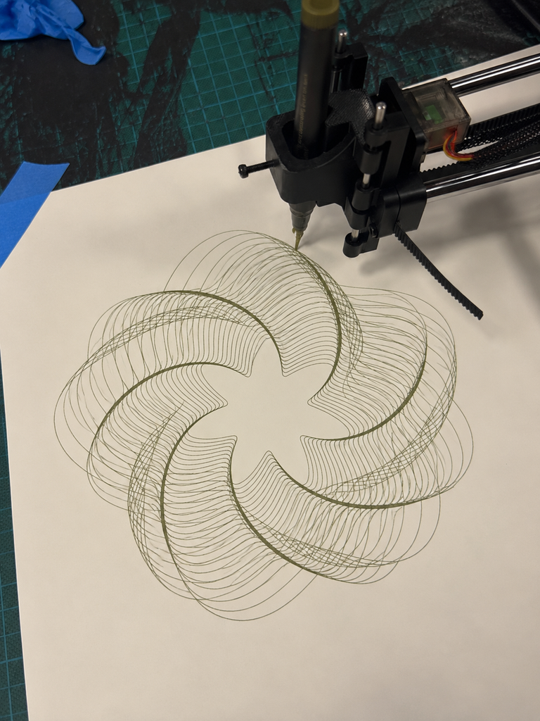
Experiment 4 – More Overlapping Waves
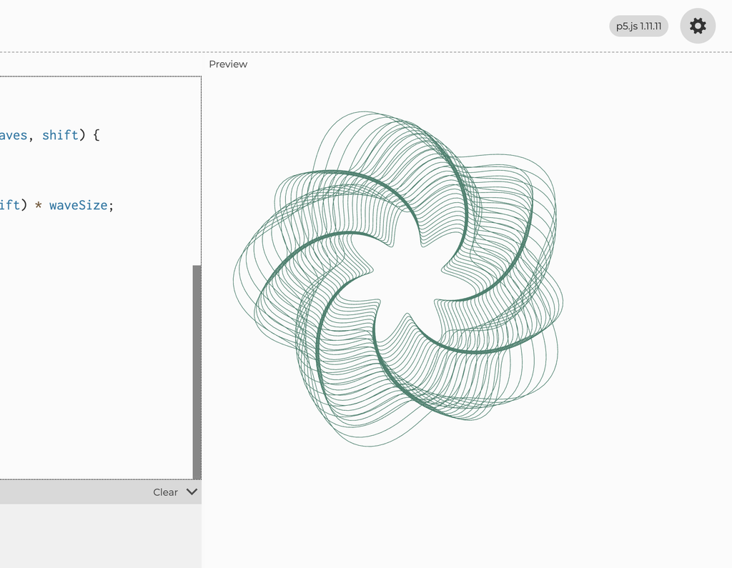
For my second experiment, I did the opposite and increased the number of wave layers. I wanted to see what would happen if I added more lines and made them overlap.
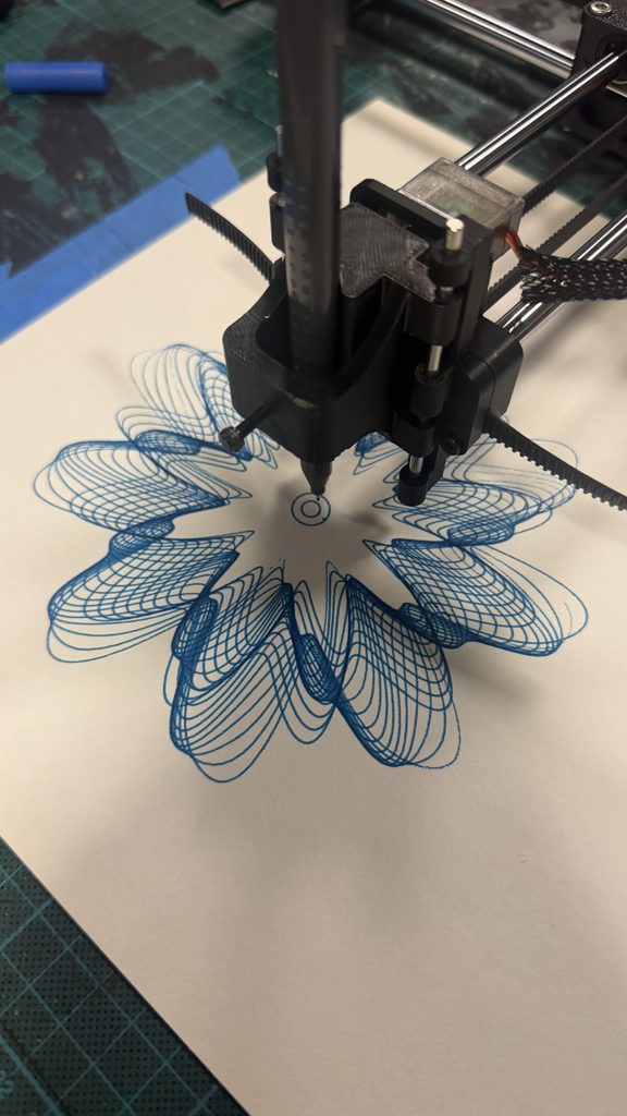
I plotted this version using a green pen. The drawing became much more detailed, and some areas looked darker because so many lines crossed each other. I liked how the curves created a flower-like shape, but I felt that certain areas were too crowded. I preferred my final Transformation drawing because it had a better balance between the lines and the empty spaces.
What I learned
These experiments showed me how changing the number of layers can completely change a drawing. The simpler version had fewer overlaps, while the second version had much more detail. I realized that adding more lines doesn’t always make a drawing better, and that the spacing between them is just as important.
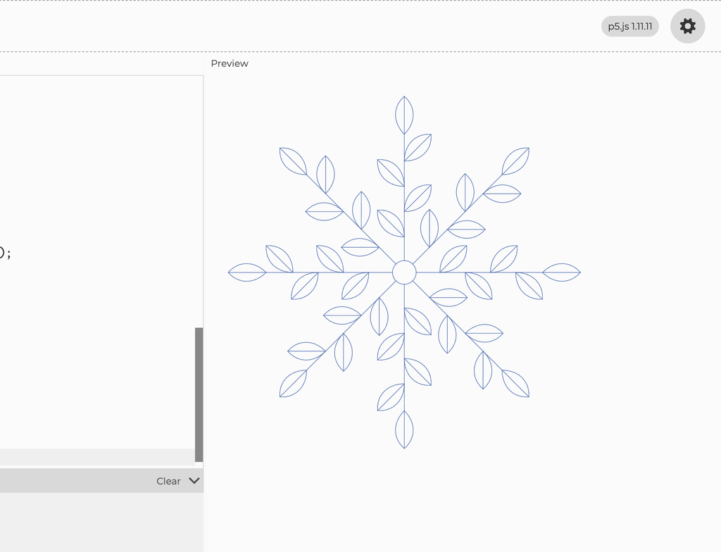
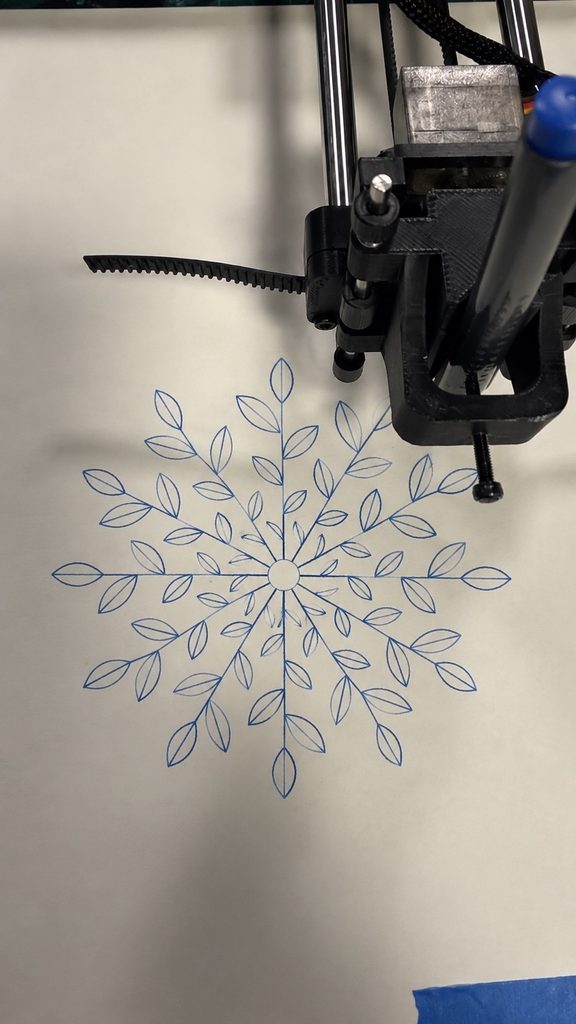
Experiment 5 – Simplified Growth
For my first Growth experiment, I reduced the number of branches from 12 to 8 and used fewer leaves. I wanted to see how the drawing would look with more space between the branches.
I plotted this version using a pink pen. I noticed that the leaves were easier to see because there was less overlapping, and the pattern looked more open. However, I felt that it looked a little too empty compared to my final Growth drawing. I preferred the final version because the extra branches made it look fuller and more detailed.
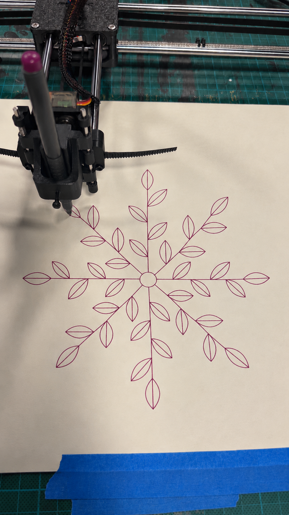
Experiment 6 – Different Leaf Sizes
For my second experiment, I kept the 12 branches but changed the sizes of the leaves. I made the leaves smaller near the center and larger toward the outside to see how this would affect the pattern.
I plotted this version using a blue pen. I liked how the different leaf sizes made the drawing look more natural, but I noticed that some of the smaller leaves near the center were harder to see. I preferred my final Growth drawing because the leaves looked more consistent and the pattern felt more balanced.
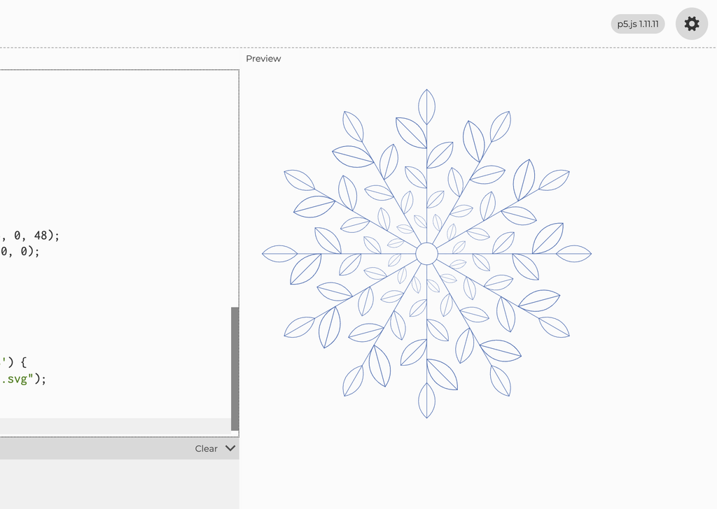
What I learned
These experiments showed me how changing the number of branches and the size of the leaves could make a big difference. I realized that I preferred a fuller pattern, but I also needed to think about spacing so the smaller details would still be visible when plotted.
Developing Balance
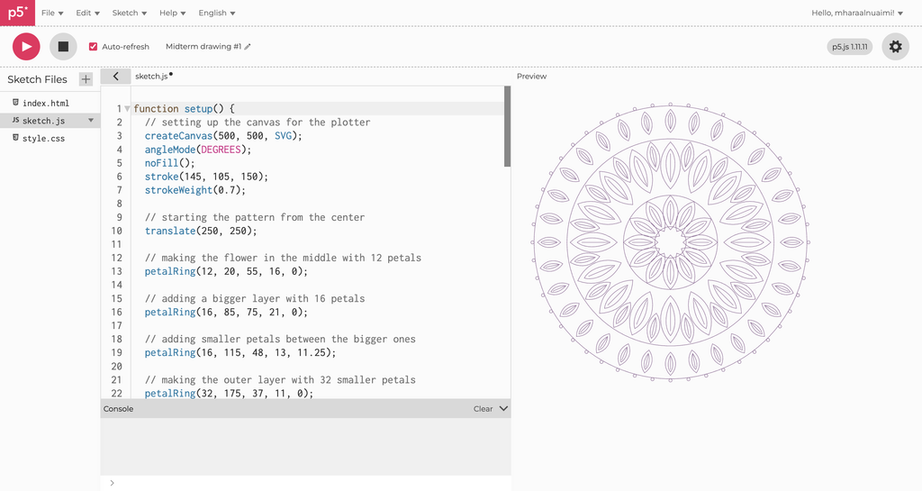
My final Balance drawing developed from the original lotus experiment.
I created a new function called petalRing() that allowed me to control the different layers separately. By adjusting the number of petals, their sizes, and their positions, I could create more variation while keeping the pattern symmetrical.
The final design includes four main petal rings, along with concentric circles and smaller circles around the outside.
Compared to my original lotus pattern, I felt that this version had more variation and that the different layers worked better together.
I also liked how the symmetry connected to my concept of Balance, representing stability and the sense of control we try to maintain.
Developing Transformation
Once I had developed Balance, I started thinking about how I could create a second drawing that looked different but still connected to my overall concept.
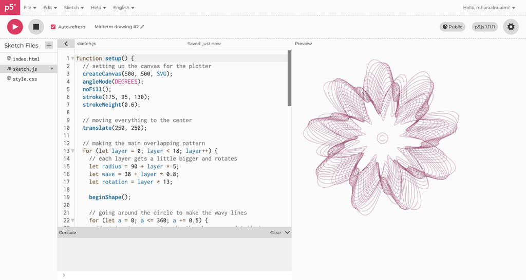
I wanted to move away from symmetrical petals and explore something less structured, so I experimented with sine and cosine functions to create overlapping circular waves.
The final design uses 18 main layers and another 8 layers with different wave patterns. By adjusting the radius, wave size, and rotation, I could change how the curves interacted.
What interested me was how individual lines followed mathematical rules, but together they created something much more complicated.
This became Transformation because the overlapping curves reminded me of how different experiences can influence one another and change the direction we take.
Developing Growth
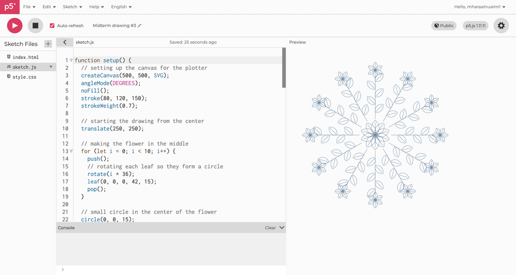
For my third drawing, I wanted to return to floral shapes, but I didn’t want to create another circular mandala similar to Balance.
Instead, I experimented with repeating leaves and branches that extended outward from a shared center.
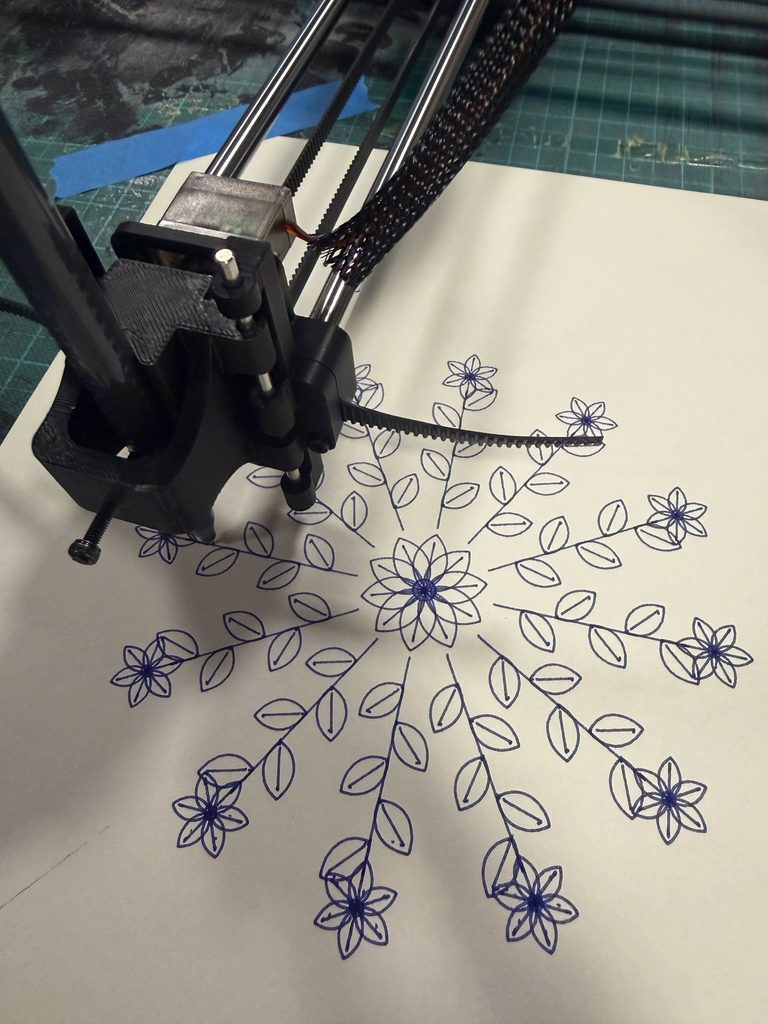
I used Bézier curves to create the leaves and repeated them along 12 branches, with smaller flowers at the ends.
I liked how this created a pattern that resembled a plant growing in different directions. This eventually became Growth, representing how we continue developing and moving forward.
p5.js links:
Balance: https://editor.p5js.org/mharaalnuaimi/full/OBfzh0rfY
Transformation: https://editor.p5js.org/mharaalnuaimi/sketches/lqcLSXZ9J
Growth: https://editor.p5js.org/mharaalnuaimi/full/JtdL8mYzn
How My Ideas Developed
Looking back, my project changed from a butterfly-inspired drawing into a series of three different patterns.
The butterfly experiment made me realize that I wanted a stronger concept, while the lotus experiments helped me explore repetition and symmetry in more detail. Revising the lotus into Balance also showed me that I didn’t have to settle for my first design.
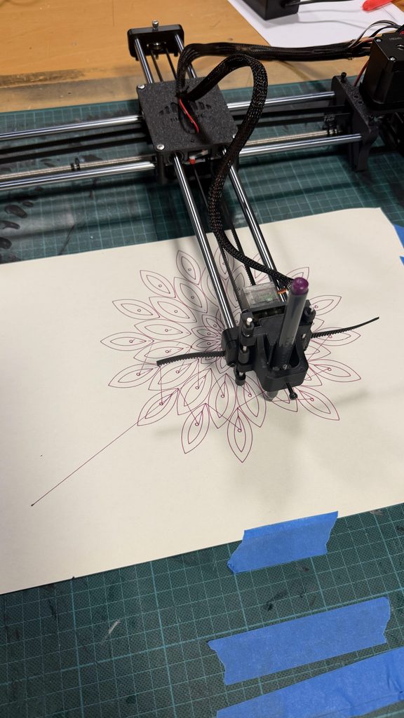
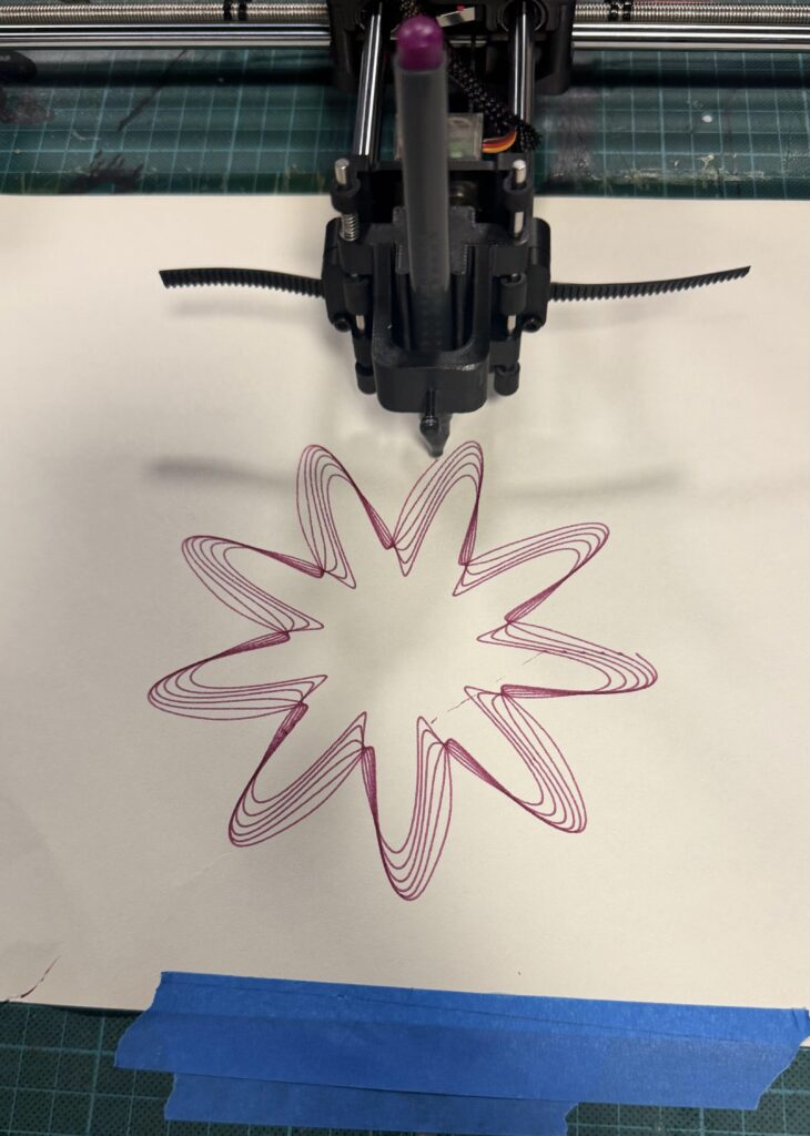
Working with the pen plotter introduced another challenge because some details that looked clear digitally didn’t always appear the same way on paper. For example, thicker markers made certain areas harder to distinguish, while poor pen contact sometimes caused missing lines.
These experiences made me think more carefully about how the complexity of a drawing affects its physical result. I realized that experimentation isn’t only about changing materials, but also about questioning whether the design itself could work better.
3. From p5.js to the Pen Plotter
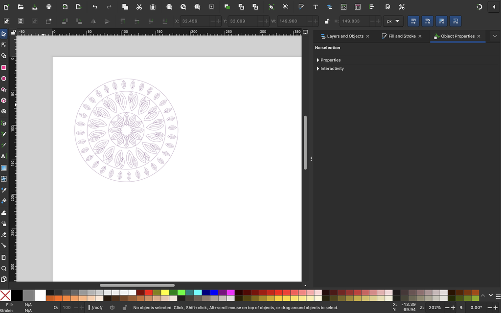
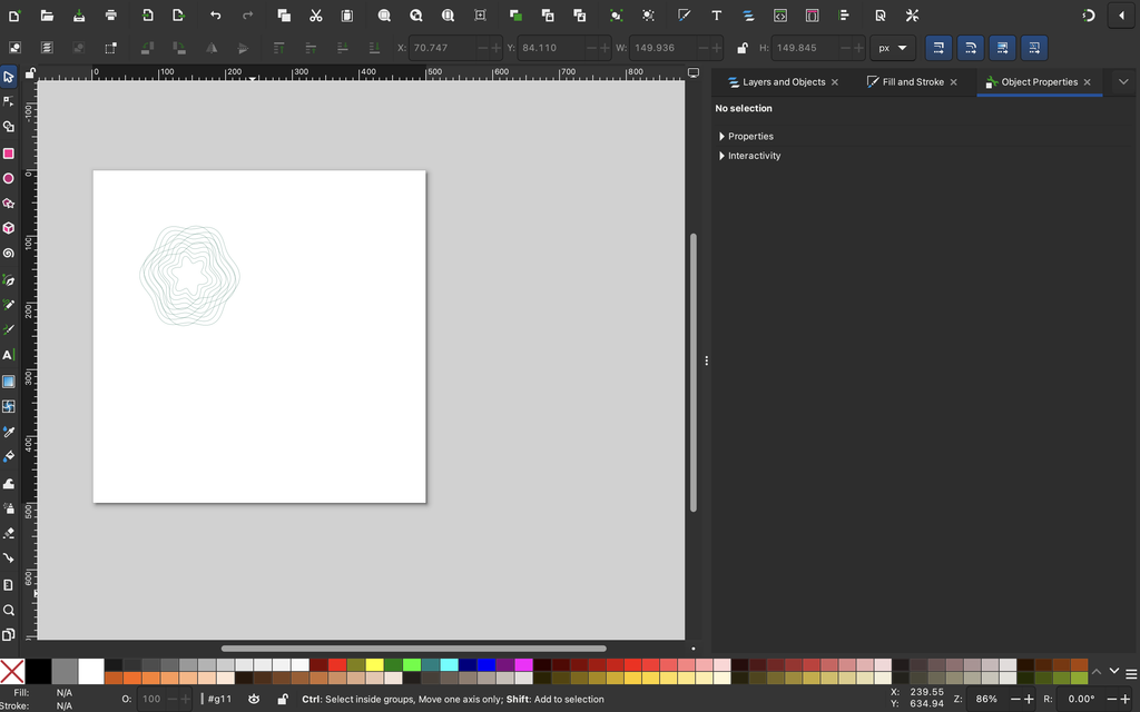
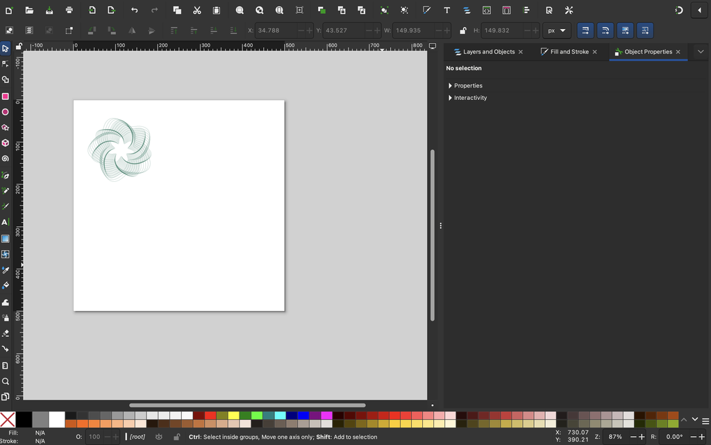
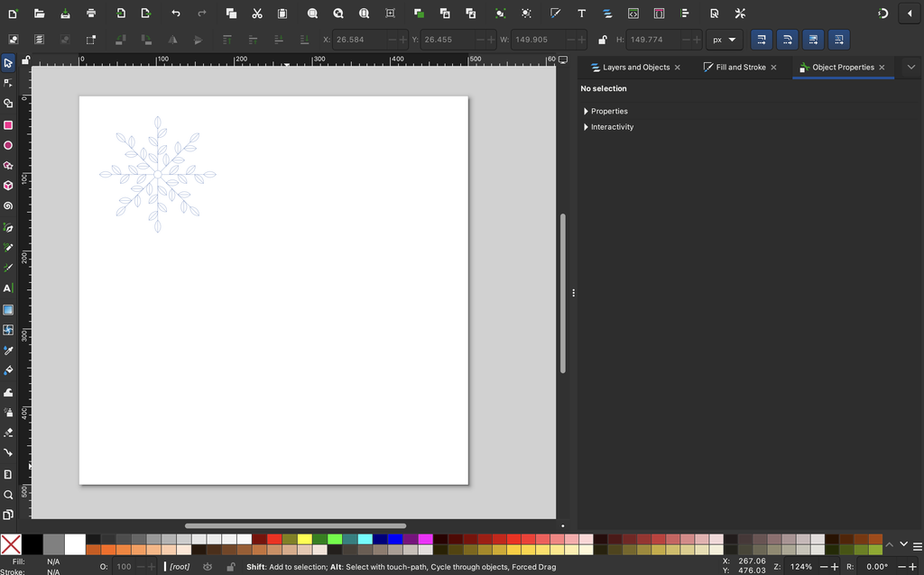
Once I was satisfied with the digital designs, I exported them as SVG files using the SVG renderer in p5.js. I also added a keyboard command that allowed me to save each drawing by pressing S.
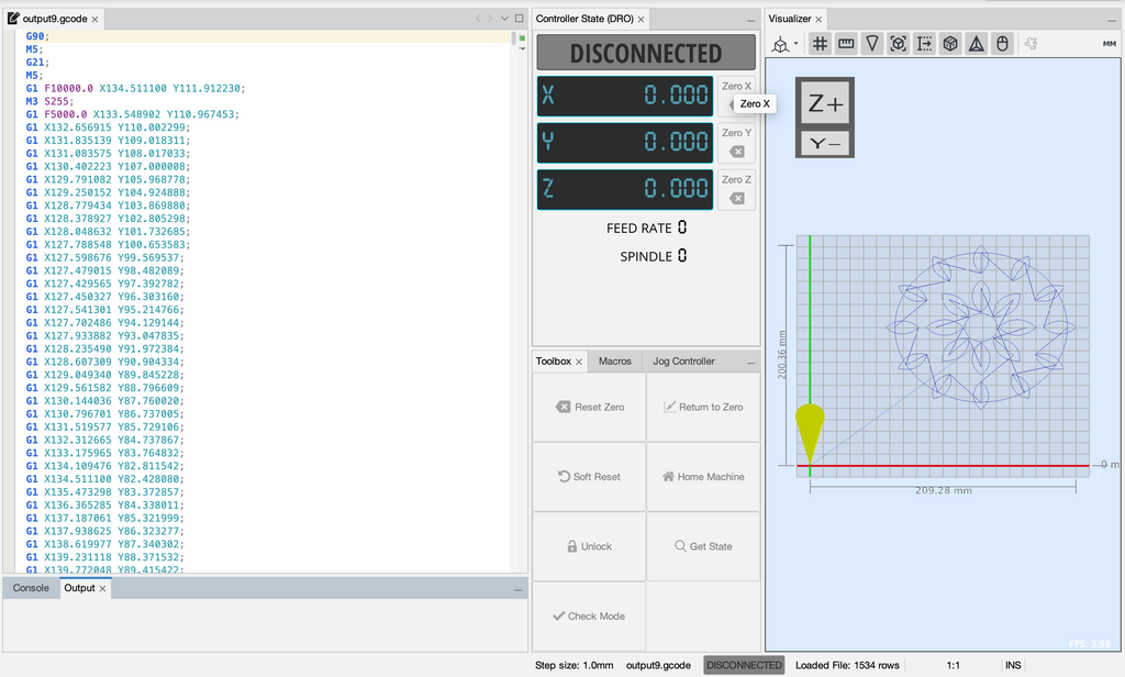
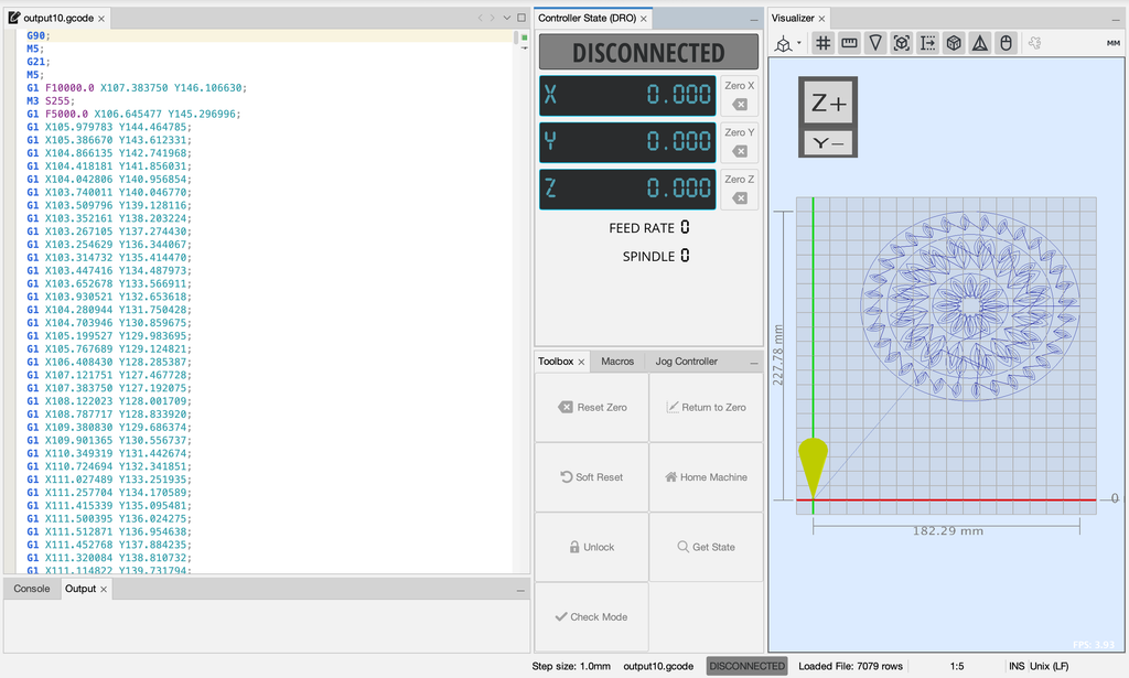
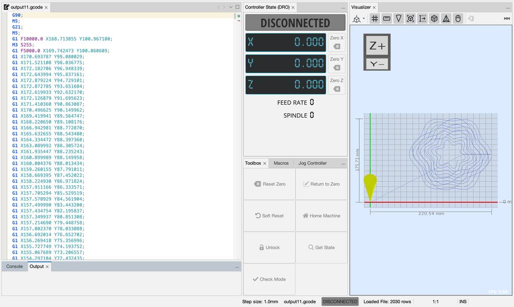
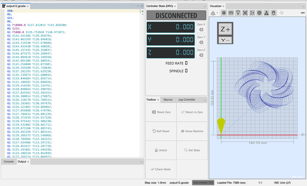
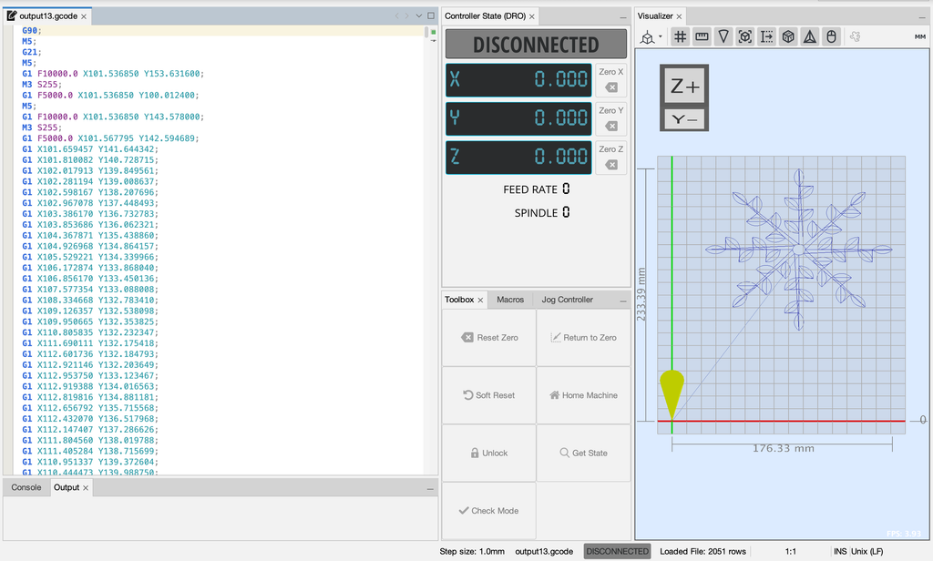
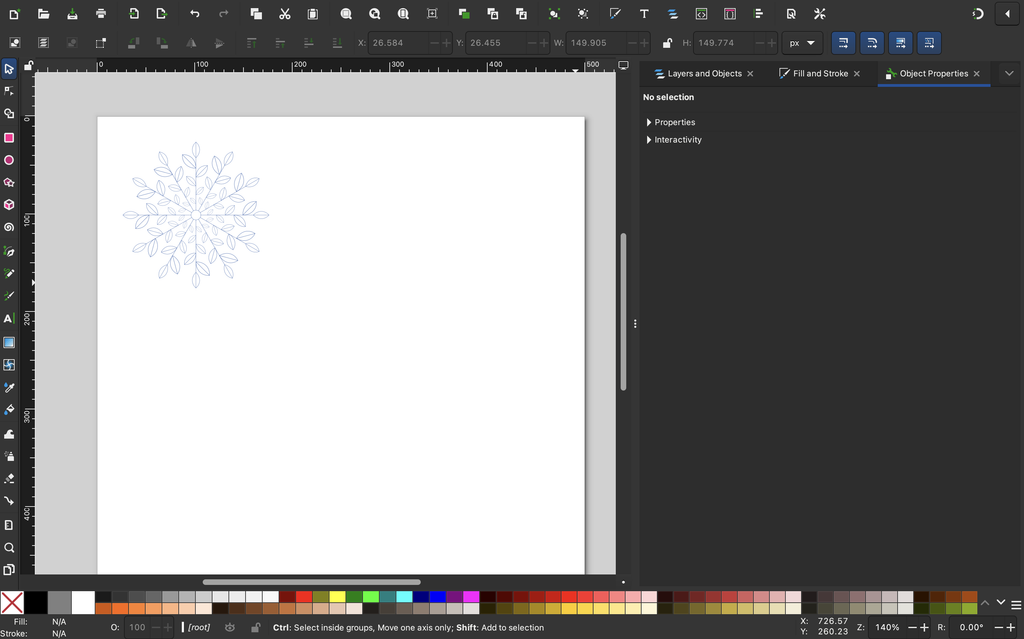
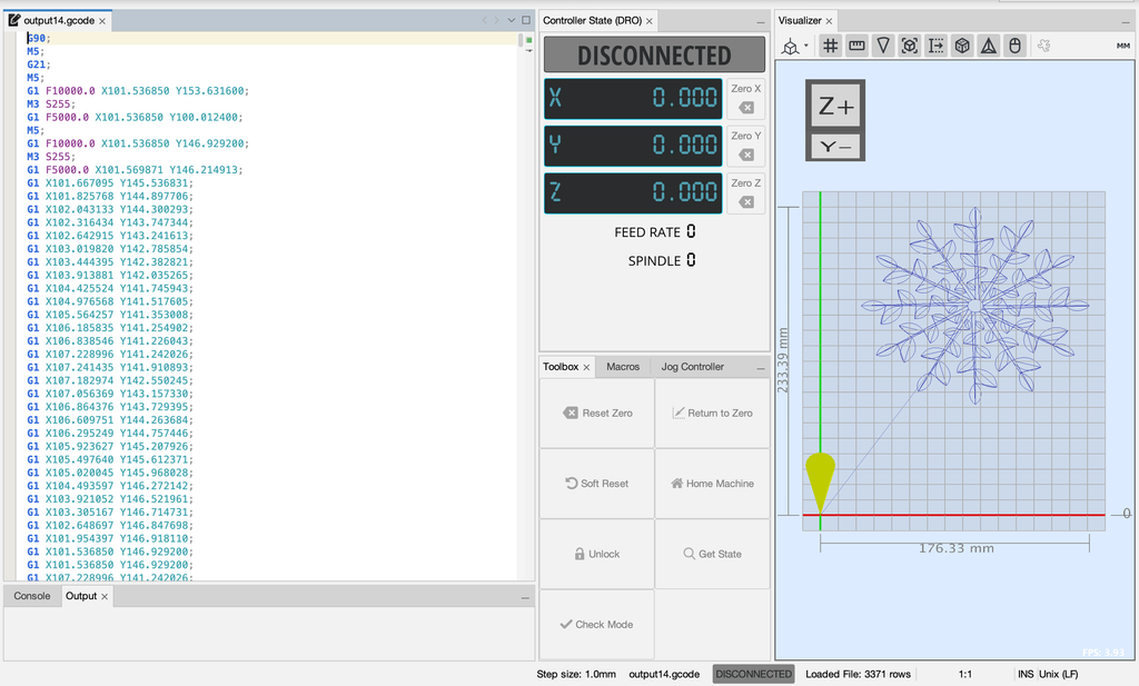
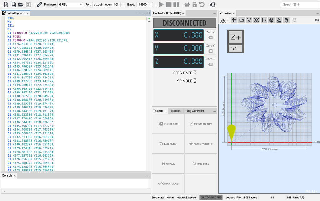
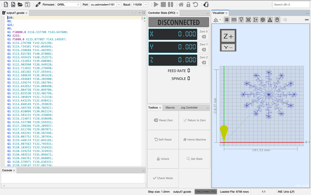
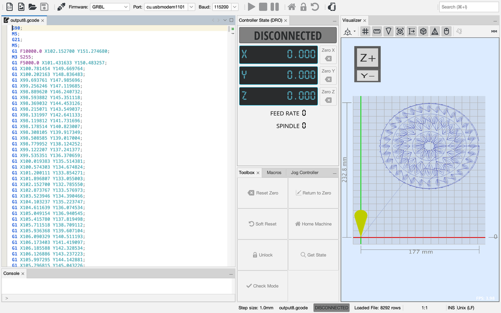
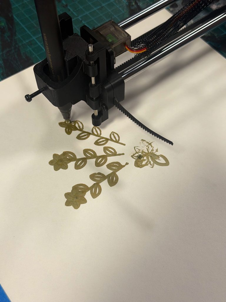
I then converted the SVG files into G-code and opened them in Universal Gcode Sender (UGS), which sent the instructions to the pen plotter.
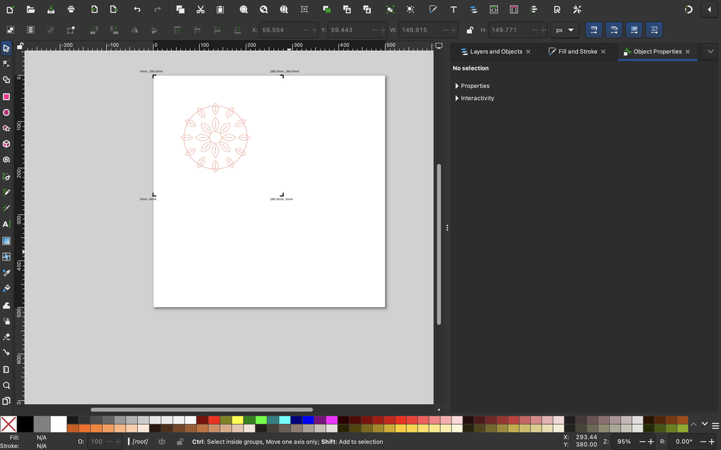
My workflow was to create the drawings in p5.js, export them as SVG files, and open them in Inkscape to convert them into G-code. I then loaded the G-code into Universal Gcode Sender, connected the pen plotter, and started drawing.
One thing I quickly realized was that a drawing looking good on the screen didn’t guarantee that it would turn out the same way on paper.
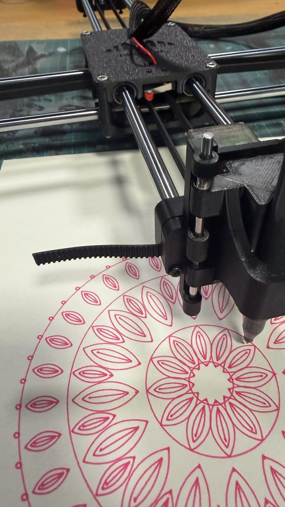
The plotter had to physically follow each path, and the final result depended on the pen, paper, and machine movement.
Universal G-code Sender:
Video of the Pen Plotter:
4. Experiments and Iterations
I experimented with different colors, pens, paper, and plotting conditions to see how these choices affected the final drawings.
Experiment 1: Pen Colors
I tested purple, pink, green, blue, and gold pens.
I noticed that lighter colors gave the floral patterns a softer appearance, while darker colors made the lines more visible.
For example, I liked the pink pen for Balance because it complemented the delicate petals. The darker green worked well for Transformation because the overlapping curves remained visible.
It was interesting how changing only the pen color could make the same design feel different.
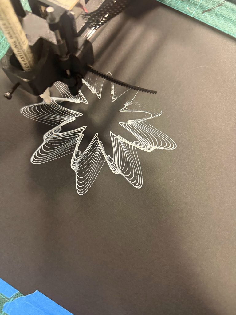
Experiment 2: White and Black Paper
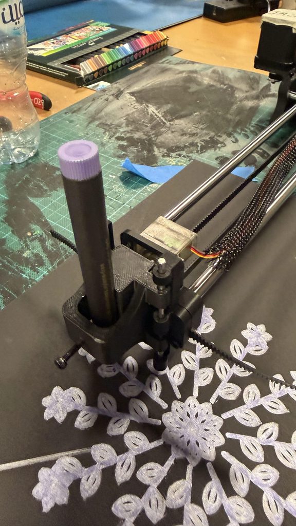
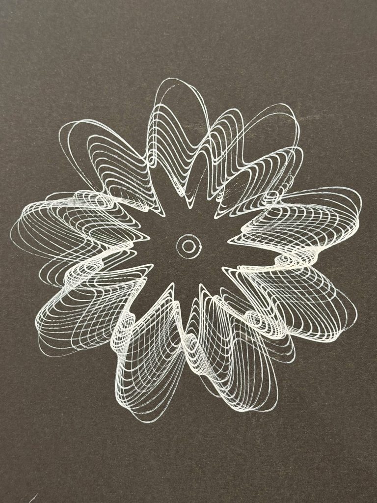
I also experimented with drawing on black paper using lighter-colored markers.
The contrast gave the patterns a different appearance, but some details were less visible depending on the pen.
I eventually preferred white paper for my final drawings because the smaller details were clearer, especially in the more complicated designs.
Experiment 3: Thin Pens vs. Thick Markers
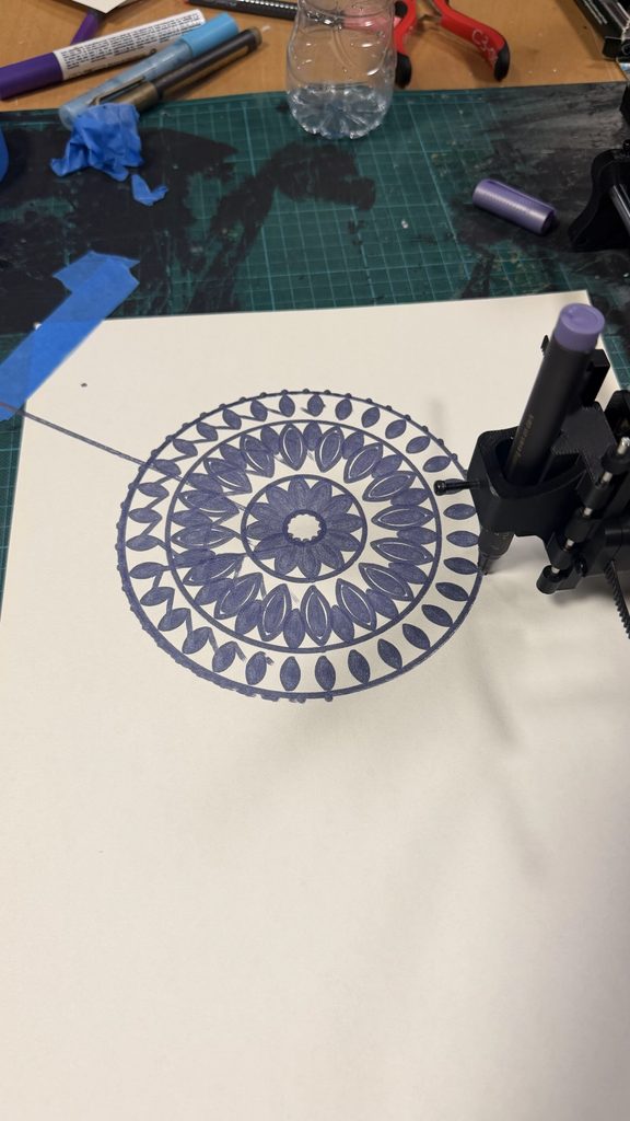
This experiment made one of the biggest differences.
Thin pens preserved the individual lines and smaller details, while thicker markers made some areas look crowded, especially where shapes overlapped.
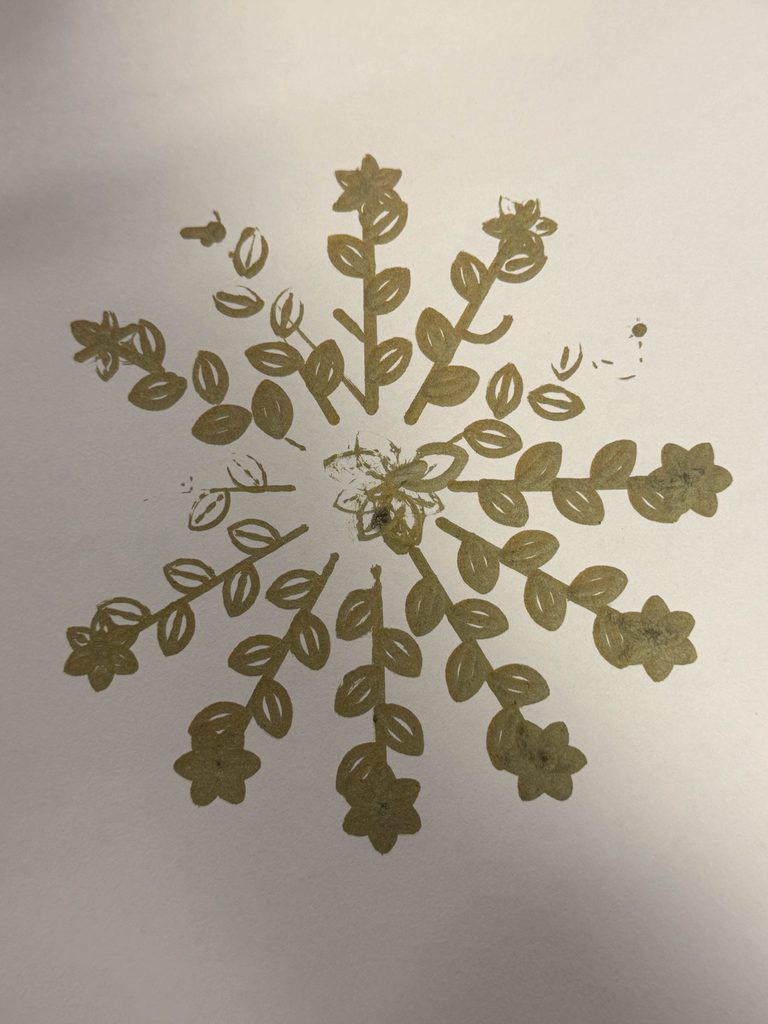
For example, I tried plotting Growth using a thick gold marker. Although I liked the color, the leaves and flowers became heavier, and some details were difficult to distinguish.
I noticed something similar when comparing thicker-marker versions of Balance with the pink fine-line version.
This made me realize that pen thickness was something I needed to consider while designing the patterns, not just when plotting them.
Experiment 4: Overlapping Lines and Unexpected Marks
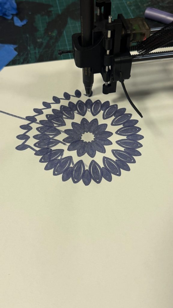
I also noticed how overlapping lines behaved differently on paper.
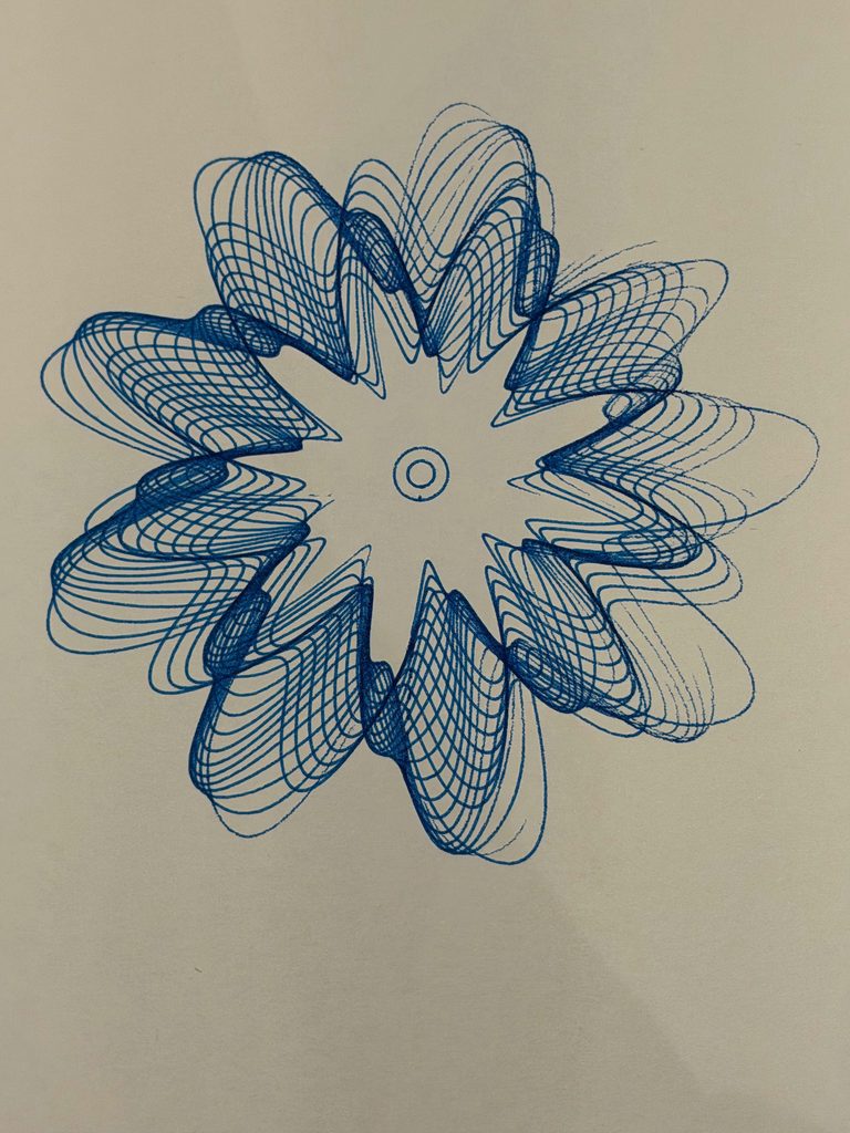
This was especially visible in Transformation, where many curves cross each other. Some areas became darker because the pen passed through several nearby lines, which added more variation to the drawing.
However, some tests also had unwanted connecting lines that weren’t part of my intended design.
Although I couldn’t identify the exact cause of every mark, these experiments showed me how the physical drawing process could produce unexpected results.
5. Challenges
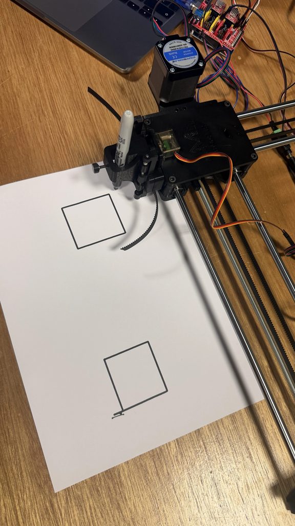
One of the biggest challenges was that some of the pen plotters weren’t working properly. My classmates also experienced issues, including a machine that would start plotting but stop after around 30 seconds. However, if it was a simple shape like a square or something that takes less than 30 seconds it would draw it out.
We eventually borrowed Professor Jack’s pen plotter, which allowed me to continue experimenting and complete my drawings.
Another problem was that the pen sometimes lifted too much or didn’t make enough contact with the paper. This caused some lines to appear faint or disappear completely.
It was frustrating because the digital designs looked complete, but the physical drawings sometimes had missing sections.
I had to compare different tests and choose the versions where the lines were more complete. I also became more careful about which pens I used, since thicker markers sometimes made the details harder to see.
6. Final Series
After testing different versions, I selected the three drawings that I felt worked best.
My decisions were based on how complete the lines were, how clearly the details appeared, and which colors I preferred.
Some earlier drawings had missing or faint lines because of the pen contact issues, so I chose the versions that best preserved the original designs.
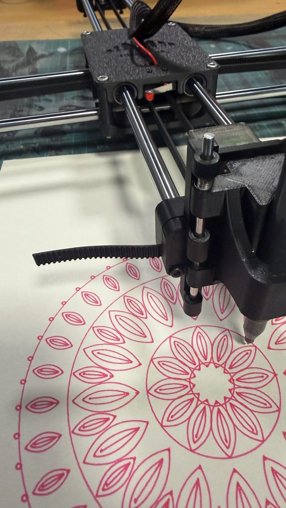
Balance – Pink
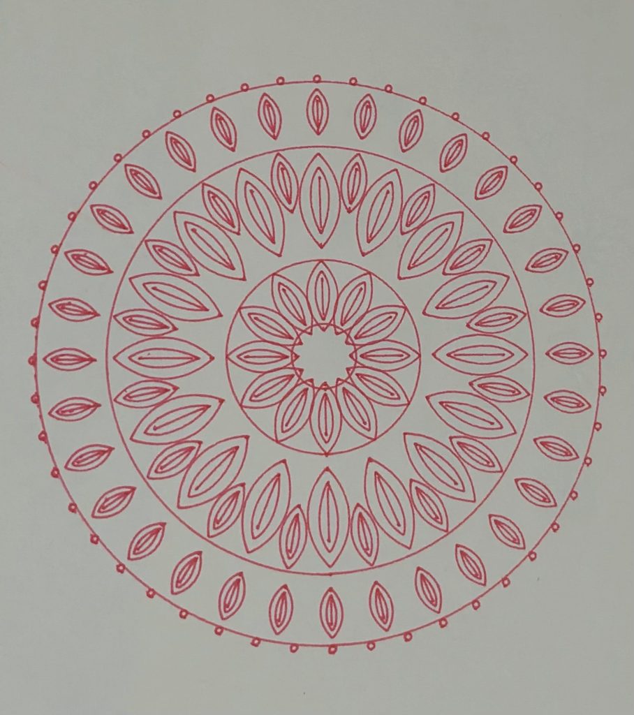
I chose the pink version because I liked how the color complemented the floral pattern. The thin lines also made the different petal layers and small circles easier to see.
Compared with the thicker-marker experiments, this version looked more detailed and organized, which suited the idea of Balance.
Transformation – Green
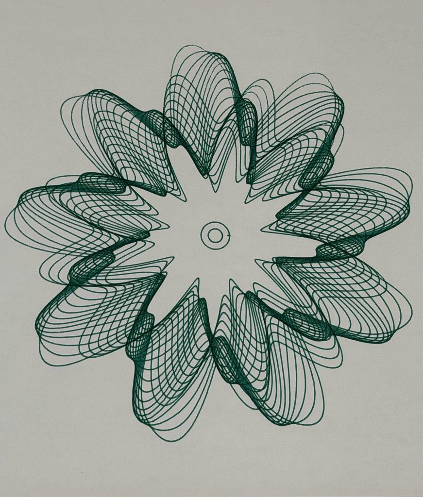
I selected the green version because I liked the contrast between the darker overlapping areas and the individual curves.
Even though the design has many intersecting lines, the shapes remain visible. I felt this version showed the complexity of Transformation without becoming too crowded.
Growth – Blue
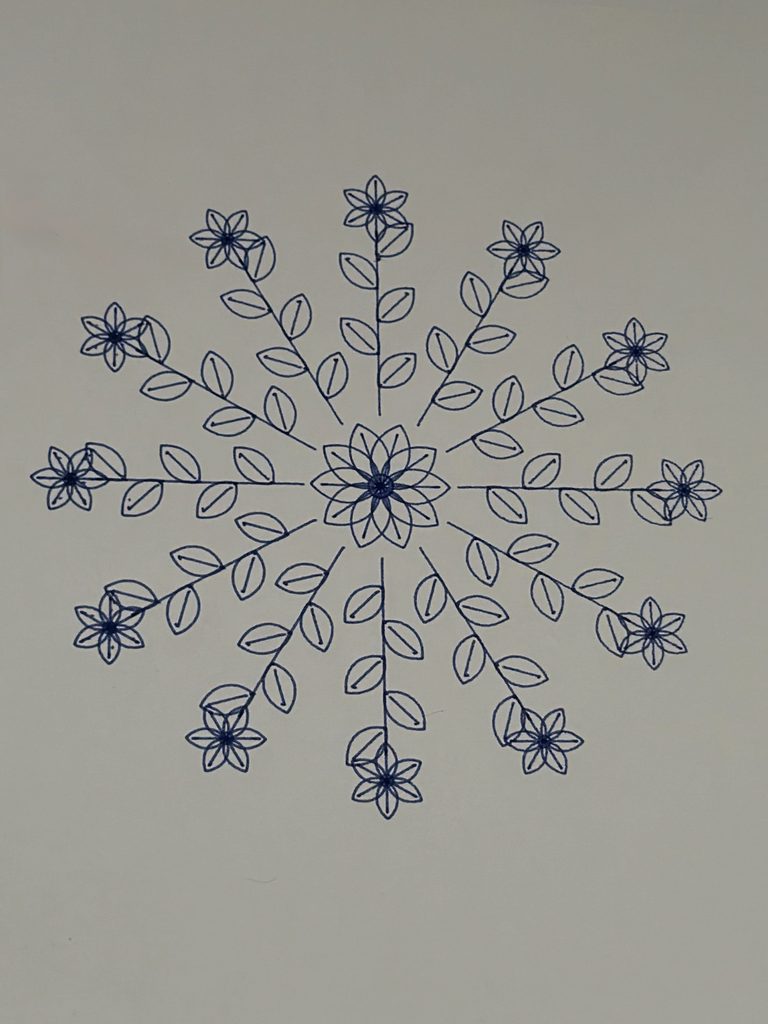
For Growth, I chose the dark blue version because the leaves, branches, and flowers were clearer than in some of my thicker-marker experiments.
I especially preferred it over the gold version because the individual botanical details were easier to distinguish.
The Three Drawings Together
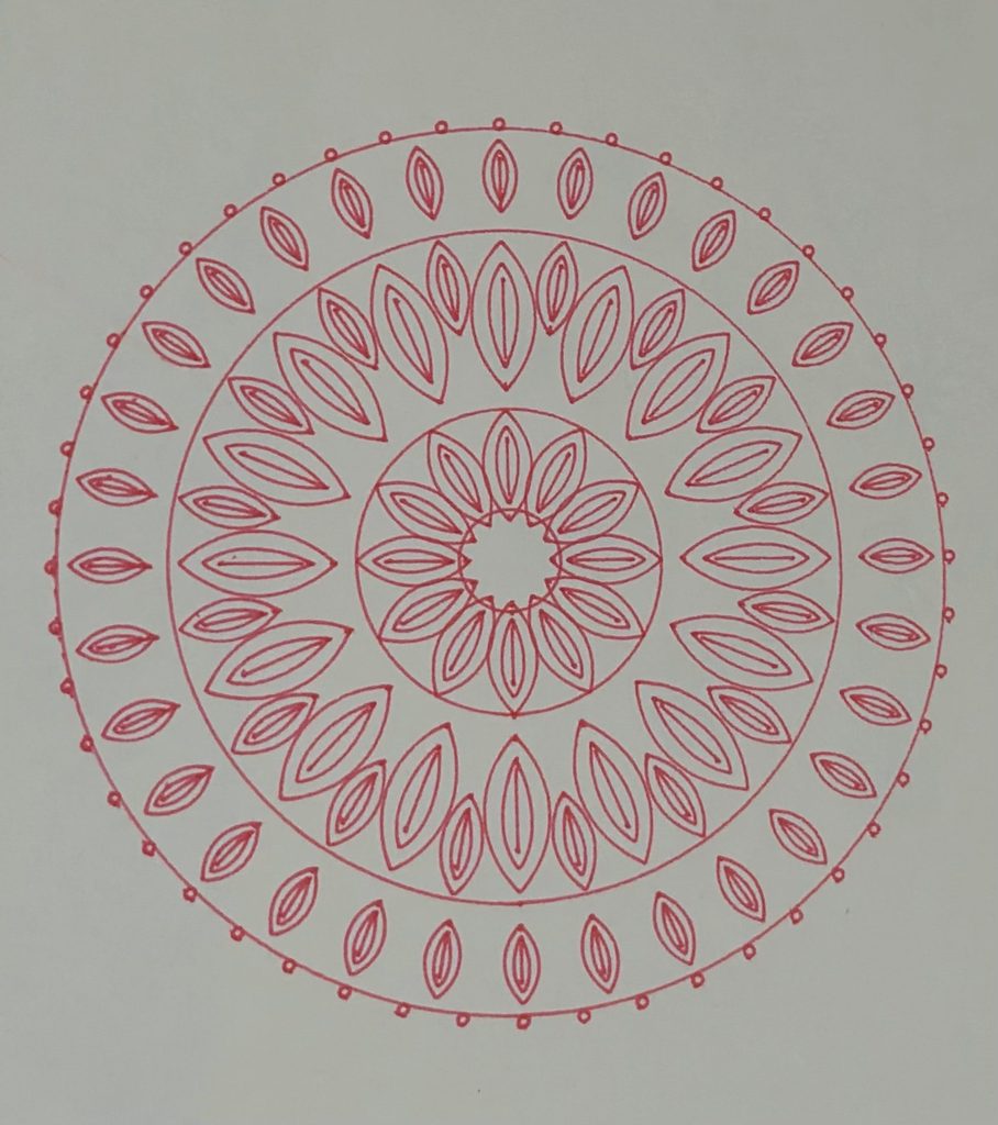
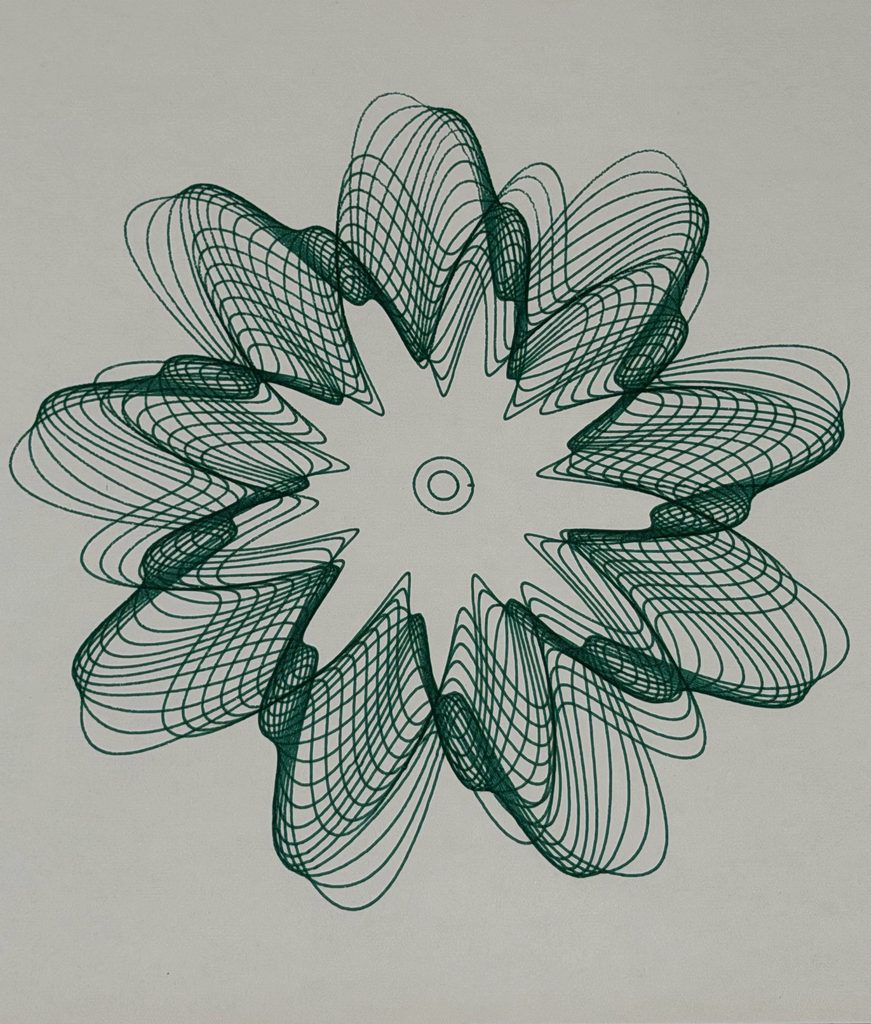
I wanted the three drawings to feel connected without looking exactly the same.
Balance begins with a structured, symmetrical design. Transformation introduces more complexity through overlapping curves, while Growth uses repeated shapes to create something that extends outward.
Although the three drawings look different, they are connected through repetition and mathematical rules. Balance uses symmetry to represent stability, Transformation uses overlapping curves to represent change, and Growth uses branches extending outward to represent development. I wanted the series to show how these ideas are connected rather than treating them as separate stages. What I found especially interesting was that the process of creating the drawings reflected the same idea. I started with a plan, experimented with different possibilities, and had to adapt when things did not turn out as expected.
7. Critical Reflection
Before starting this project, I mainly focused on using code to create detailed patterns. I wanted the drawings to look interesting and was excited to experiment with different shapes.
However, working with the pen plotter made me realize that the physical process was just as important as the digital design.
Changing something as simple as the pen could completely affect the result. Thin pens preserved the details, while thicker markers sometimes made the patterns too crowded. The paper also influenced how clearly the drawings appeared.
I also learned the importance of revising my ideas. My original lotus pattern was a good starting point, but I wasn’t completely satisfied with it. Instead of keeping the first version, I changed the algorithm until I created a design I preferred.
The technical problems were another important part of the process. I had to deal with machines that weren’t working properly, missing lines, and drawings that didn’t always turn out as expected.
What I found interesting was how these experiences connected back to my original concept. I started with clear rules and expectations, but I still had to adapt along the way. Even though I controlled the code, I couldn’t completely control how the final drawings would turn out.
What I Would Improve
If I had more time, I would experiment with adjusting the spacing between lines, especially where the patterns become too dense.
I would also like to use multiple pen colors within a single drawing by separating different parts of the design into layers.
Another improvement would be checking the pen height and contact with the paper more carefully before plotting, to reduce the chances of missing lines.
I would also like to experiment with the order in which the plotter follows different paths to see whether that could reduce unwanted connecting lines.
Overall, I enjoyed seeing my designs move from code on a screen to actual drawings on paper. The process involved more trial and error than I expected, but that was also what made it interesting.
I started this project wanting to explore balance, transformation, and growth through patterns. Looking back, I realized that I experienced all three while making the drawings. I began with a clear idea, changed my designs through experimentation, and learned from the problems I faced along the way.