Requirements:
Concept
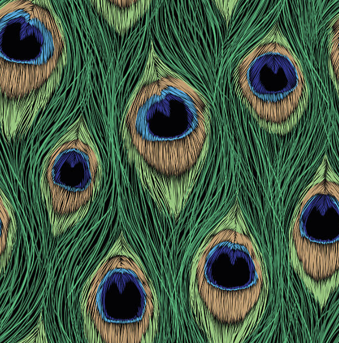
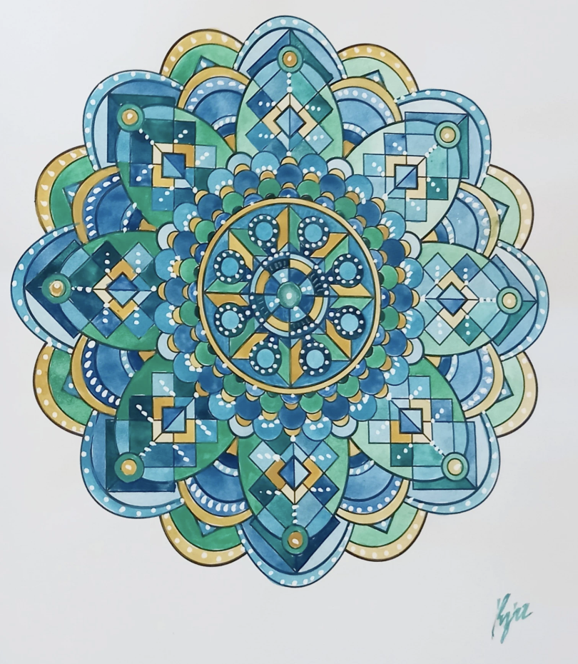
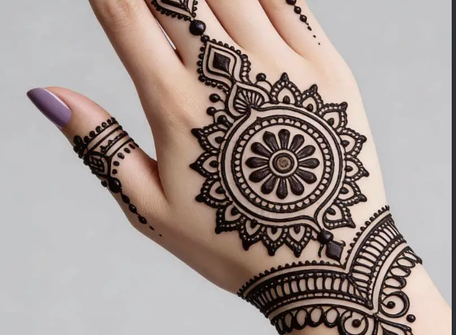
My concept is inspired by the circular composition of mandalas and traditional henna and the layered, eye like details of peacock feathers. I was interested in how both bring many smaller elements together to create a balanced and detailed whole. In my design, curved feather like shapes repeat around a central point, while circles and overlapping polygons give the composition a clear structure. The contrast between the soft curves and sharper geometric lines allows me to explore the relationship between organic forms and mathematical order. Repetition creates a visual rhythm, guiding the viewer’s eye around the circle and between the different layers. Through code, I can vary the number of repeated shapes, their proportions, and the details within them while maintaining the overall circular symmetry. These changes allow each version to develop its own character, with some appearing more open and delicate and others becoming dense and complex. The variation is therefore an important part of the concept because it shows how a shared set of rules can produce different outcomes. Using a pen plotter also adds another layer to this idea, as forms inspired by nature are translated into precise instructions and then drawn through mechanical movement. The project explores how nature, geometry, and technology can come together to create patterns that feel both structured and expressive.
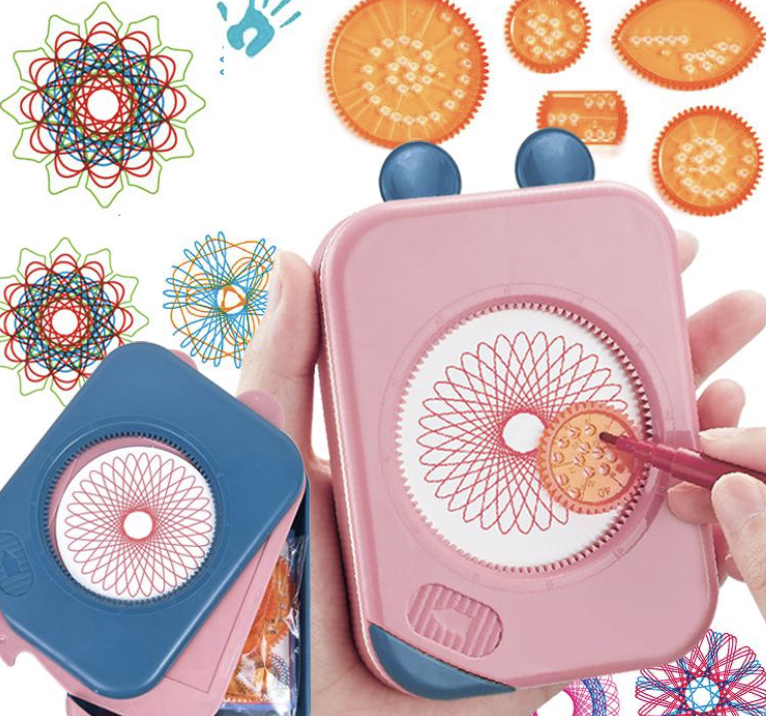
Another layer of inspiration for this project comes from the geometric drawing toys many of us used as kids, such as Spirograph wheels and circular stencils. These toys were simple, but they revealed how repeating a basic motion around a center could generate surprisingly intricate patterns. They taught a kind of playful geometry where curves, loops, and rotations created complex designs without needing to understand the math behind them. When working with the pen plotter, I realized it operates on a similar principle, but with far more precision and control. The plotter can lift the pen, change colors, and build layers in ways those toys never could. Bringing this childhood experience into the project allowed me to connect nostalgic, hands on pattern making with algorithmic drawing. It highlights how early intuitive play with geometry can evolve into structured, computational design, and how both approaches rely on repetition, rotation, and symmetry to create visually rich patterns.
Algorithm
My algorithm builds the pattern by repeating a shape around a central point. It divides a full circle by the number of petals to space them evenly, then rotates each shape into position. Smaller outlines inside the petals add detail, while circles and repeating waves form the border. Changing values such as the petal count, shape, size, and number of layers creates different designs while keeping the circular symmetry.
I used code because the entire structure of my drawing depends on precise repetition, rotation, and symmetry. The pattern is built by dividing a circle into exact angles, repeating shapes at perfect intervals, and layering curves with consistent spacing. Doing that by hand would never be as accurate or as flexible. With code, I can change one variable like the number of petals or the size of the inner shapes and instantly generate a new, perfectly balanced version. The drawing isn’t just a picture, it’s a system of rules, and code is the only way to execute those rules with the precision the design needs.
P5.js code
https://editor.p5js.org/maa9946/sketches/Ma9DjmUqw
SVG/G-Code work flow
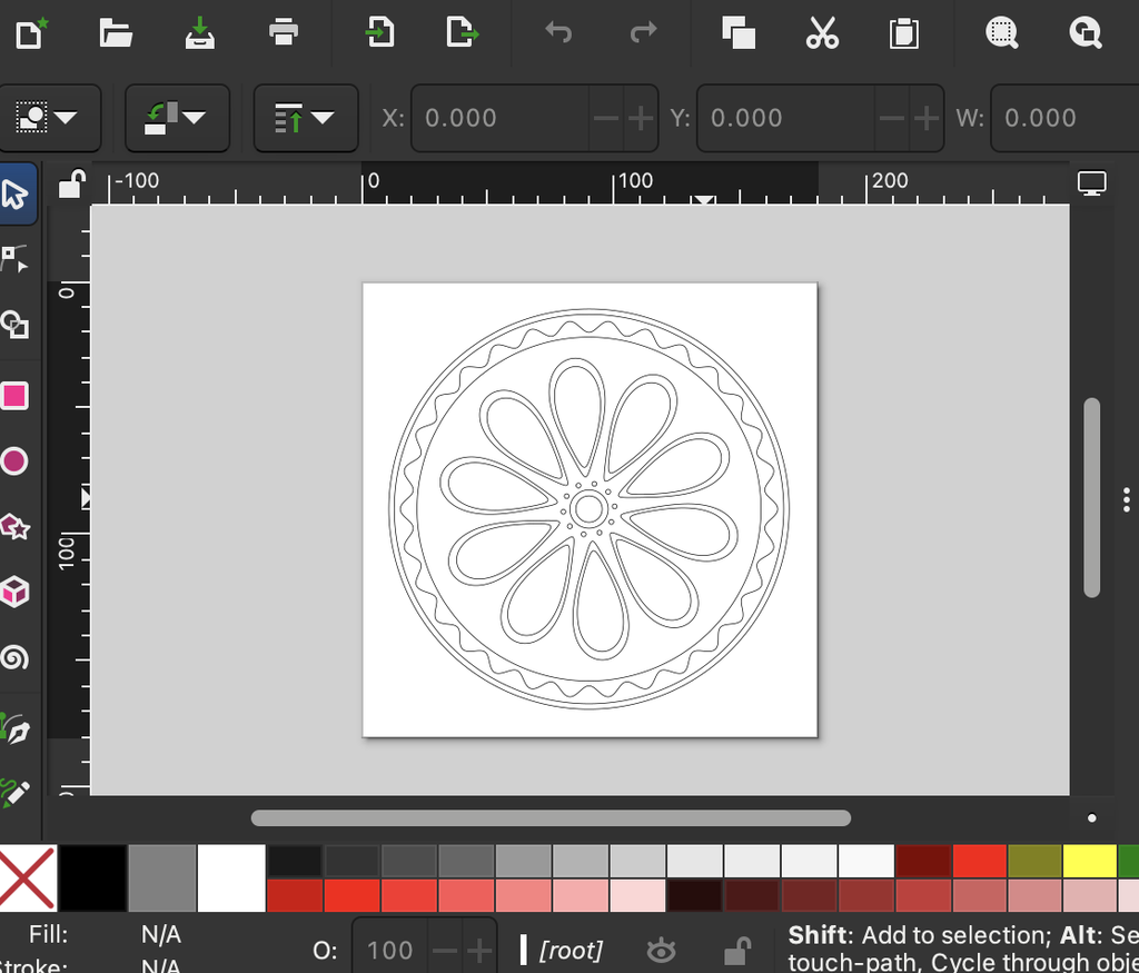
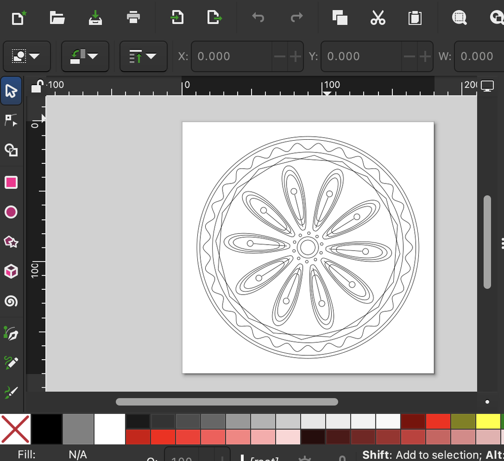
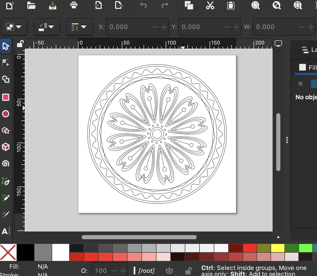
1-2-3
G code
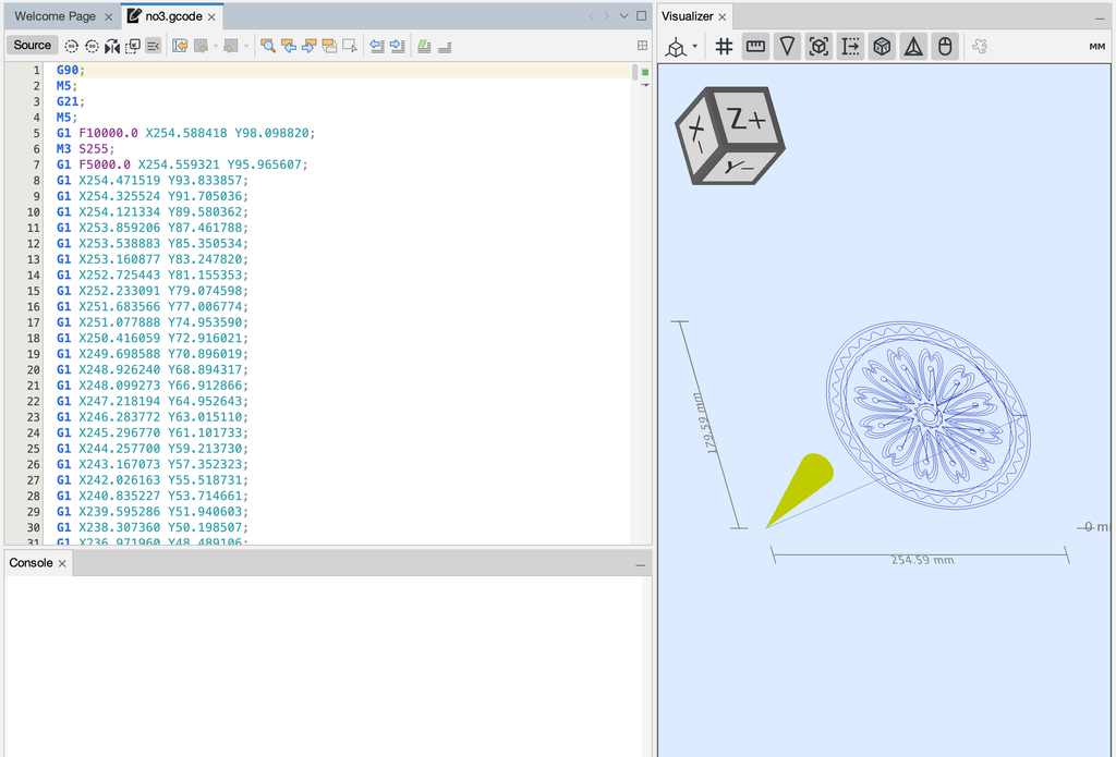
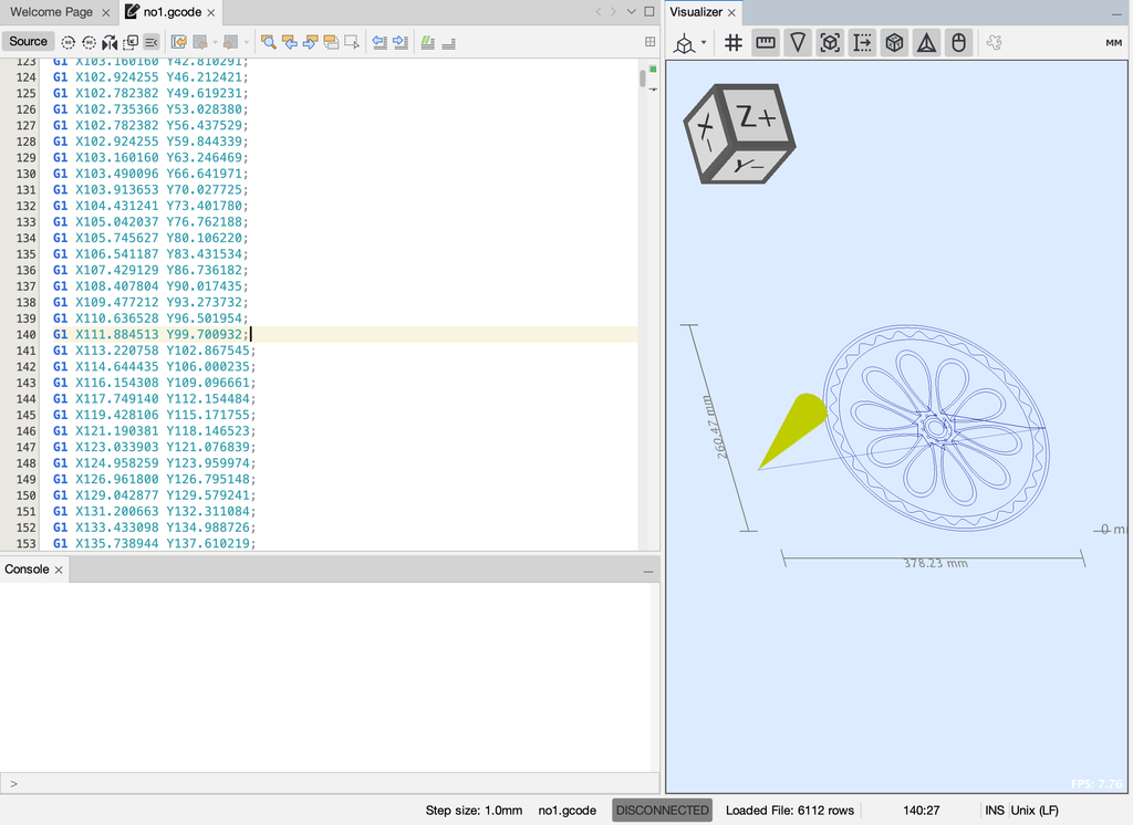
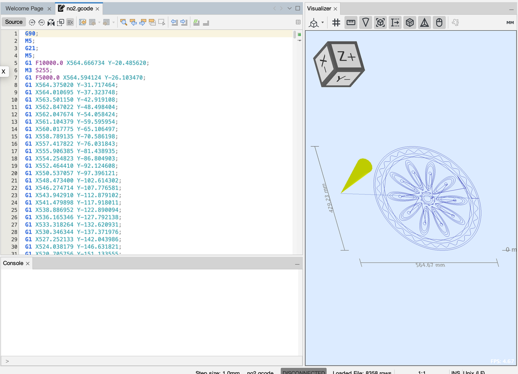
Test Drawing and iterations
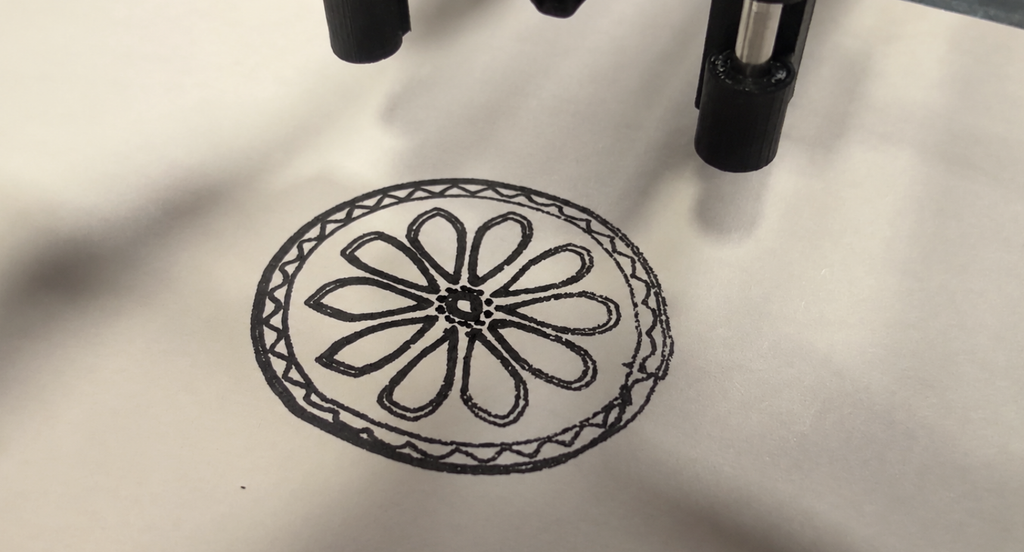
Before creating the final drawings, I went through several rounds of testing to understand how the pen plotter behaved with different pens, sizes, and materials. The first tests were mainly about the markers themselves. Some felt tip pens released too much ink, causing splotches, bleeding, or thick patches where the pen paused. Others were too dry, which made the lines break or fade. I had to adjust the pen pressure and experiment with different markers until I found one that produced clean, consistent strokes. Eventually, I switched to a less ink, smoother pen for the early tests, which helped me see the structure clearly without messy overlaps.
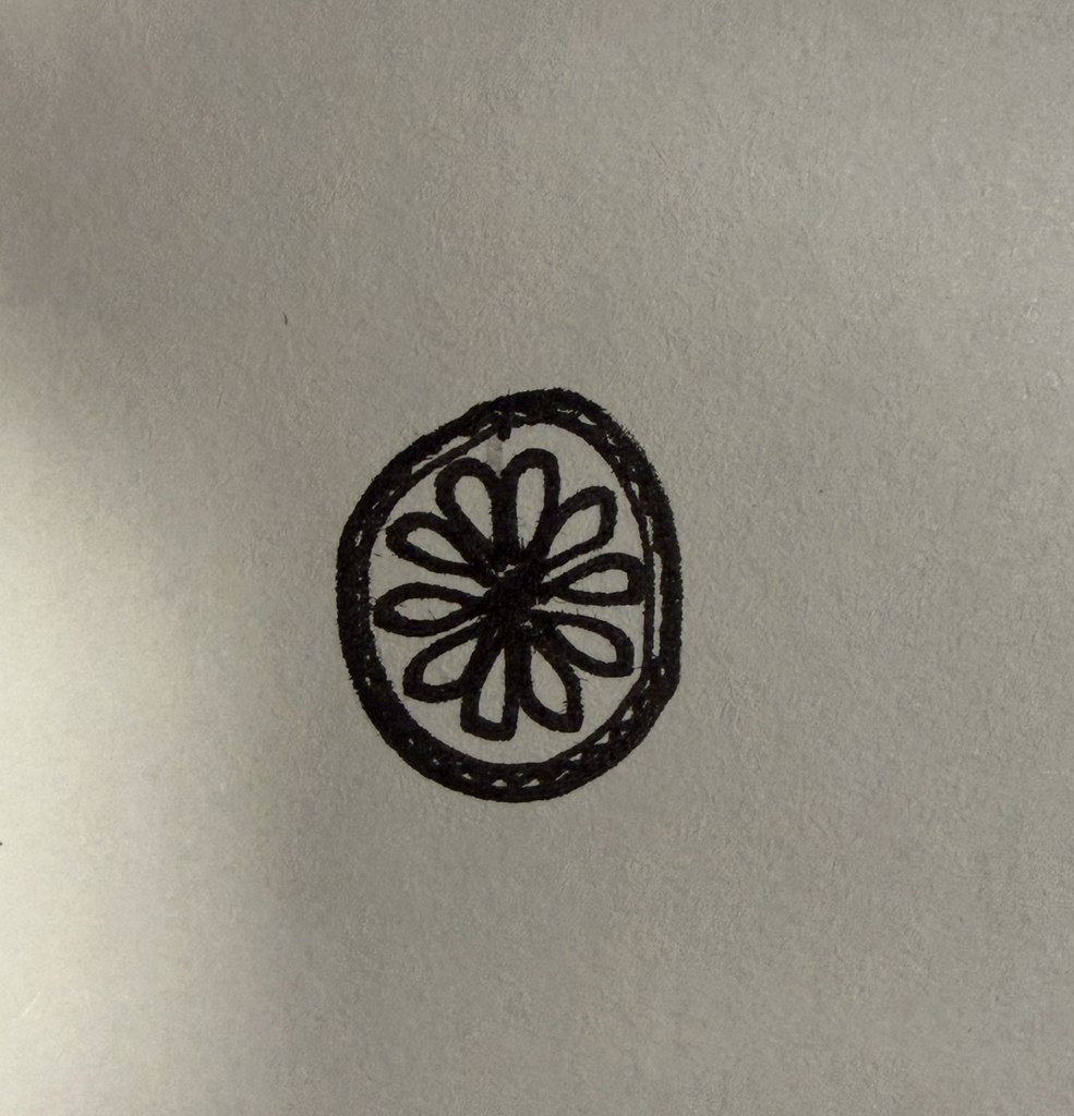
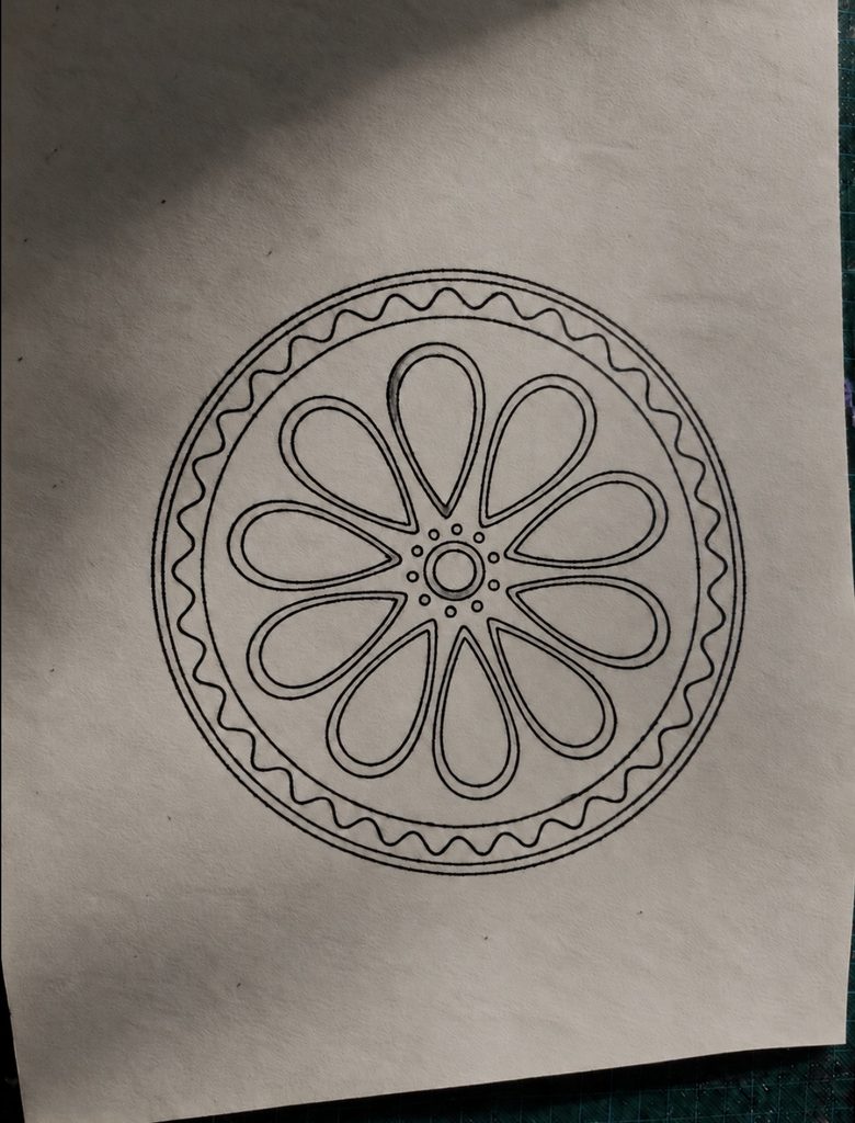
Resizing the pattern also became part of the iteration process. When the design was too small, the lines overlapped or became cramped, especially in the detailed inner shapes. The plotter’s precision made these overlaps very noticeable. Increasing the size solved this problem and gave the black marker room to show the crisp geometry. The larger version felt cleaner and more intentional, which is why I chose that scale for the final black drawing.
I also had to deal with physical issues during plotting. At one point, the paper shifted slightly, which caused the lines to misalign. I retaped the paper securely and made sure the entire surface was completely flat before running the plot again. Even small bumps or loose tape affected the accuracy, so preparing the workspace became an important part of the process.
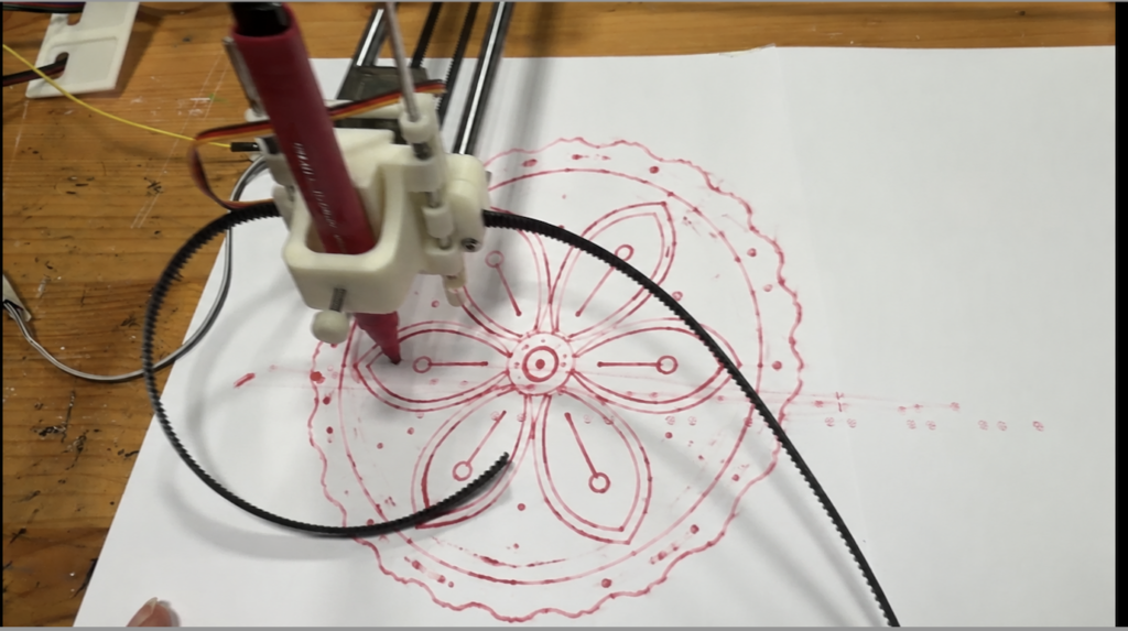
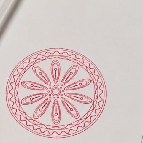
During these tests, I also tried a smooth red ink marker. It handled the plotter’s movement well and didn’t bleed as much as the blue felt tip pen. The bold red color looked visually striking, so I decided to use it for one of the final versions. It added a different mood to the same algorithmic structure and showed how color can change the character of the pattern.
These iterations testing markers, adjusting settings, resizing the design, securing the paper, and experimenting with color were essential to achieving a clean final result. The process revealed how much the physical setup influences the outcome, even when the underlying design is generated through precise code.
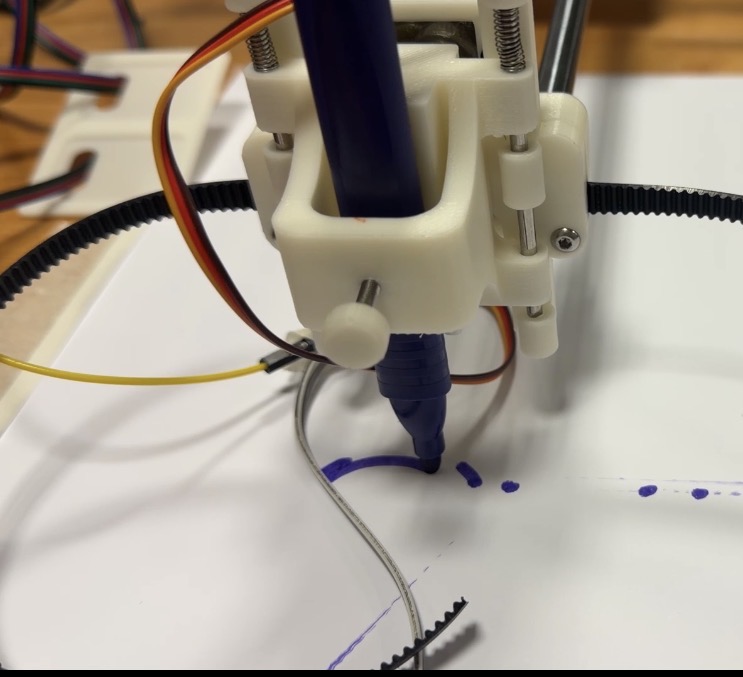
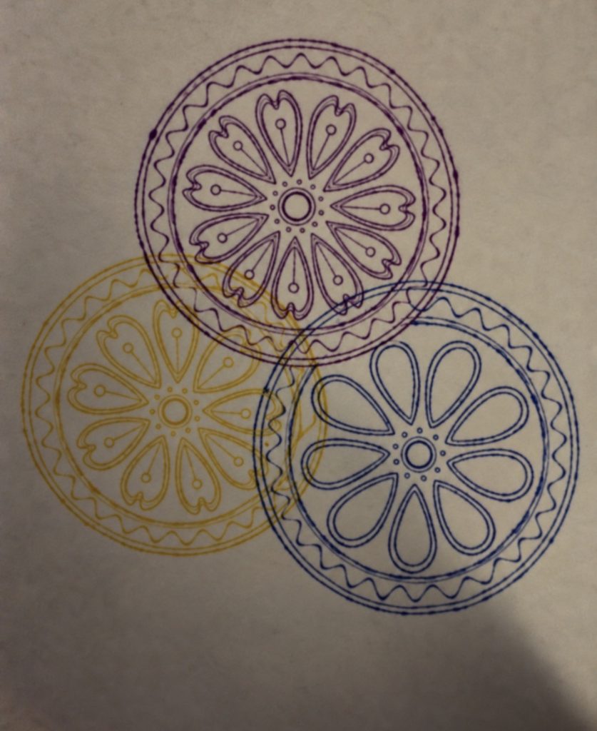
I used this experiment to explore how different colors and overlapping patterns work together. The purple, blue, and yellow helped separate the designs while showing how their lines create new shapes where they cross. I developed these ideas in my final three designs, using rotation, overlapping outlines, and color to make each piece different while keeping them connected
The final series of at least three drawings
Final three flow
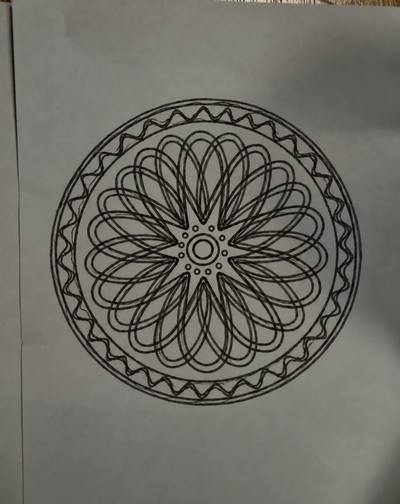
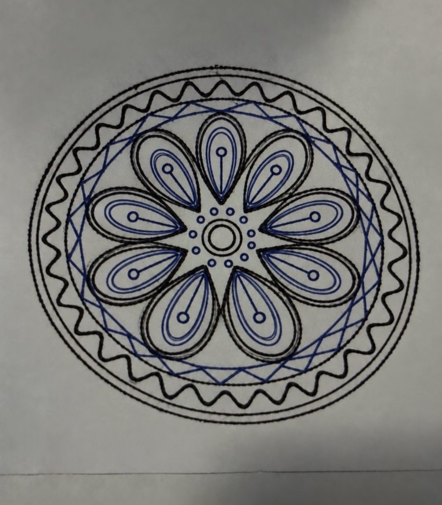
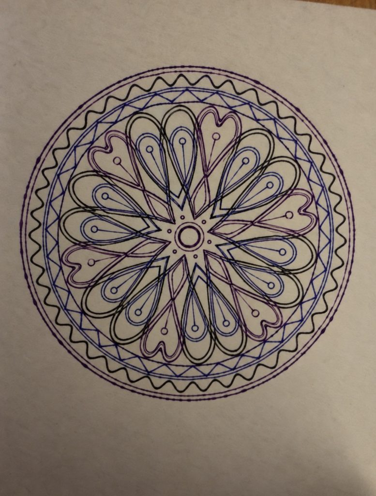
My three final designs explore repetition, rotation, and layering. The shapes inside are inspired by peacock feathers, especially their curved outlines and eye like centers. The decorative details also draw from henna, while the circular arrangement and repeated shapes are inspired by mandalas.
In the first design, I focused on repeating and rotating one shape in black. The overlapping lines create a dense pattern and a sense of movement. In the second, the feather shapes become more distinct. Blue and black help separate the details, making the peacock inspiration clearer.
The third design brings these ideas together by layering different shapes in black, blue, and purple around the same center. Their outlines cross to create new shapes and a more complex composition. This progression shows why a pen plotter suits my idea and it allows precise repetition and controlled changes in rotation, while the pen and paper still introduce small imperfections.
Critical reflection on how the pen plotter, color, layering, and physical materials shaped the final work.
The physical process of working with the pen plotter had a major impact on how my final pieces developed. Even though the algorithm defines the structure and symmetry, the machine and materials introduced their own challenges that shaped the outcome. During the early trials, I had to adjust the plotter settings, fix the pen pressure, and test different markers because some were too dry, too splotchy, or produced inconsistent lines. These tests were essential they showed me that the plotter is not just a neutral tool but something that requires calibration and care. Choosing the right pen became part of the creative decision making. I ended up using a bold black marker for most of the final work because it produced clean, confident lines that emphasized the geometry and made the pattern feel more intentional.
Color also played a surprising role. Although my concept wasn’t originally focused on color variation, the physical tests pushed me to experiment. I tried a smooth red ink marker and found that it created a striking contrast compared to the black. The dark blue and purple lines felt more vibrant and expressive, and the bold color made the circular pattern stand out in a different way. I decided to use it for one of the final versions because it added a new dimension to the design it showed how the same algorithmic structure can shift emotionally depending on the color and material.
Layering wasn’t part of my conceptual plan, but it appeared naturally in the smaller test plots.They also highlighted how the machine interprets the algorithm through real movement, where even tiny shifts in alignment or pen pressure can change the final look. But for the final this was revised and the layering can be seen with the lines overlapping to create the desired output.
Material choice was another important factor. Using card paper made the drawings cleaner and more durable compared to regular thin paper. The smooth surface handled the ink better, prevented bleeding, and supported the pen pressure without warping. This helped maintain the accuracy of the circular symmetry and kept the details sharp. The sturdiness of the card paper also made the final pieces feel more finished and professional.
Overall, the pen plotter, the trials and adjustments, the choice of pens and colors, the accidental layering, and the physical materials all shaped the final work in ways that go beyond the algorithm. The project became a collaboration between digital rules and physical realities testing, correcting, choosing, and adapting. These elements enriched the concept by showing how structured geometry interacts with the imperfections and possibilities of real tools and materials.