By: Asma Al Murr
Concept and Algorithm
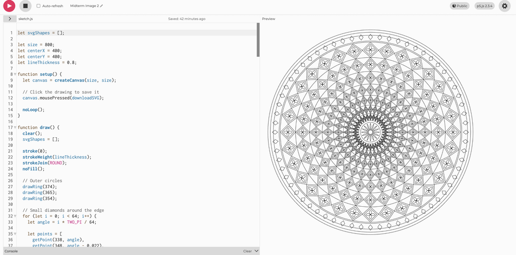
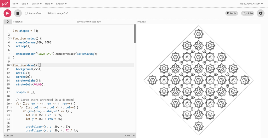
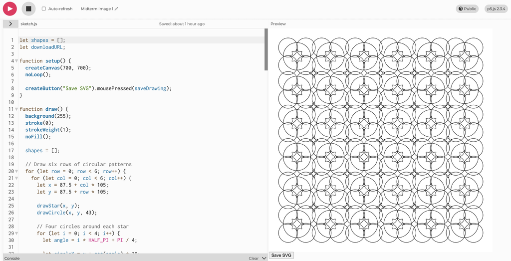
For my midterm project, I explored how Islamic inspired geometric patterns could be created through code and translated into physical pen drawings. I was interested in how simple shapes could become complex compositions through repetition, rotation, and symmetry. My three p5.js sketches use these rules in different ways: one repeats circles and stars across a grid, another arranges diamond bands and floral details around a central point, and the third repeats layered star pattern within a diamond shaped composition. I used loops to repeat the shapes and sine and cosine to calculate points around circles and position rotated details. By changing the spacing, sizes, speed of the plotter and number of repetitions, I could adjust the complexity while keeping the patterns organised. Together, the drawings explore the relationship between Islamic geometric art, computational rules, and machine controlled drawing through the pen plotter we built in class.
Inspiration:
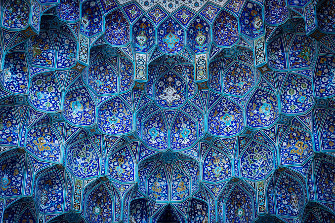
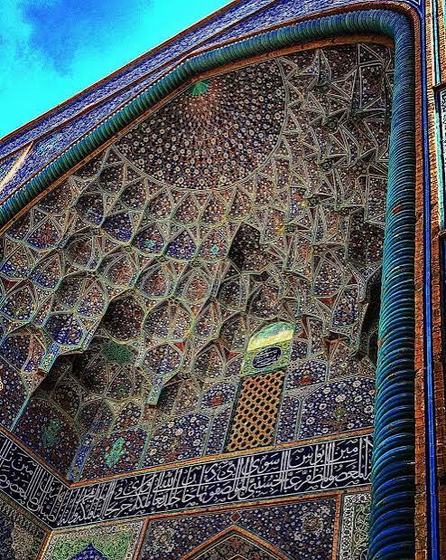
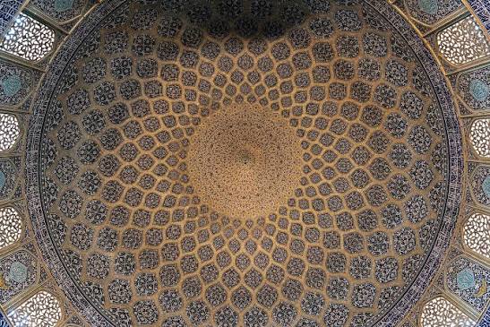
These patterns are inspired by geometric designs found in mosques and Islamic art, where repeated stars, circles, and interlocking shapes decorate tiles, carved wood, screens, walls, and ceilings. Their symmetry and repetition create intricate compositions that can appear to extend beyond their borders. In my project, I explored these visual qualities through code, using the pen plotter to translate geometric rules into ink on paper.
The Drawing Process: Pens and Paper
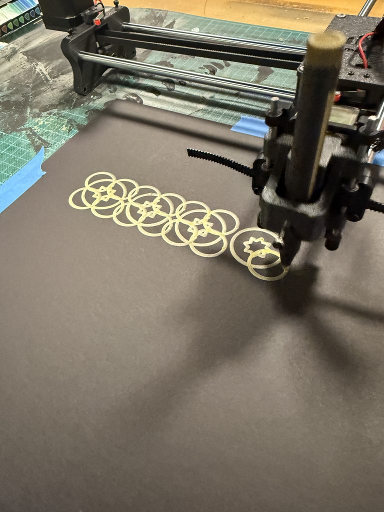
Choosing the pens and paper became an important part of designing the work. I experimented with regular white A4 paper, thicker beige A3 paper and thick A3 black paper. Also I tested out thin and thick pens, several vibrant, matte, and metallic colours. White paper allowed the finer coloured lines to remain visible, which suited the detailed mandala and star patterns but using thicker paper was better because it held the ink better. Black paper gave the metallic ink a stronger contrast and made the larger circular pattern stand out. However, I found that a thick metallic pen could obscure small shapes and curves, so I had to match the scale of the design to the width of the pen. I also checked how the pen sat in the holder and whether it maintained even contact with the paper. These decisions showed me that selecting materials was part of developing the drawing system, because the same code could produce very different results depending on the pen and surface.
SVG/G-code Workflow
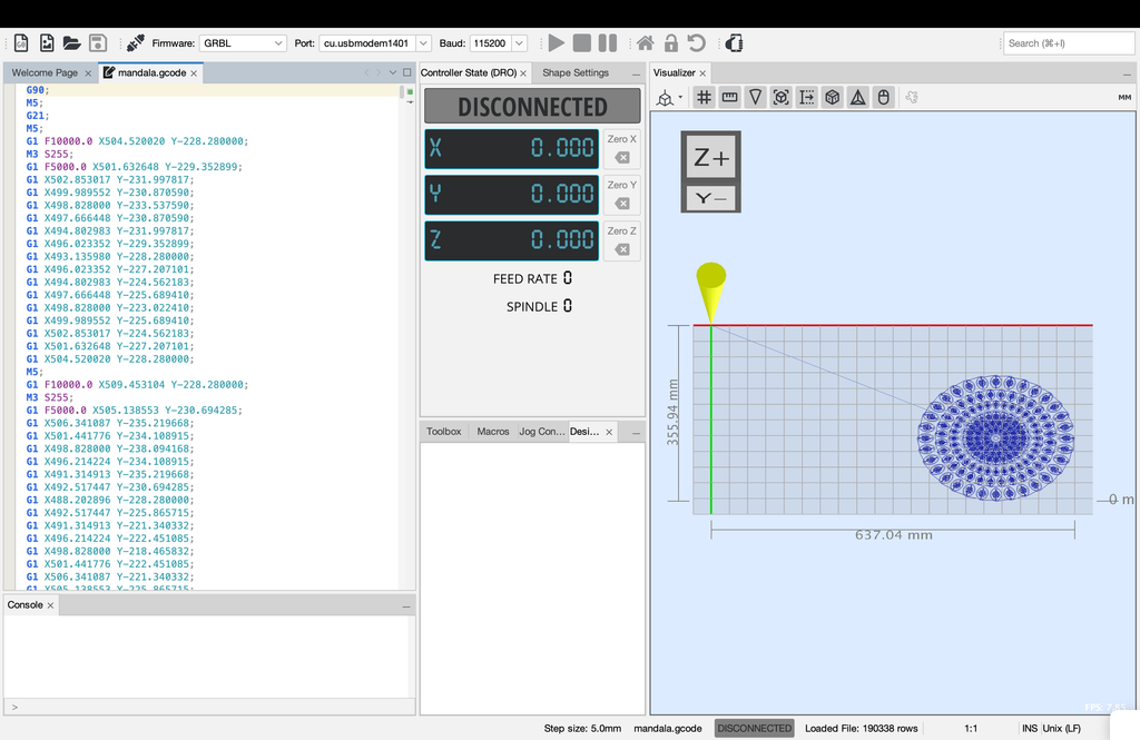
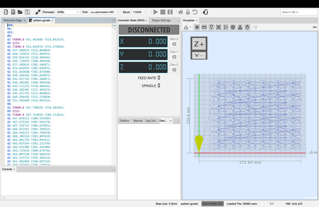
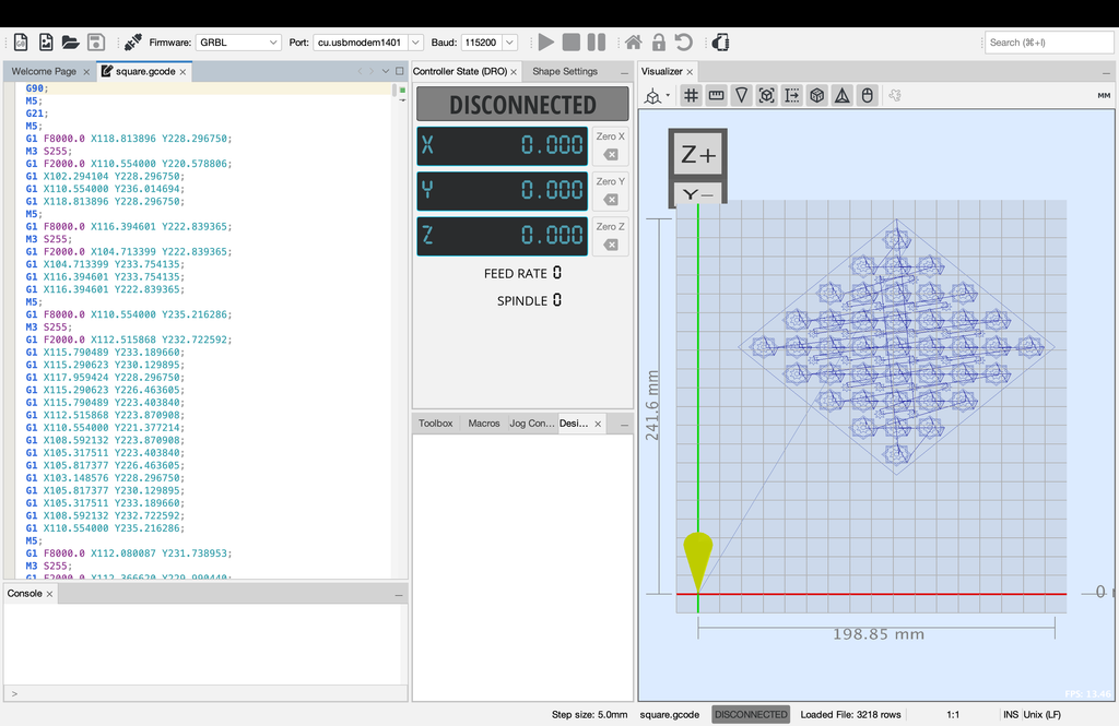
For the three final designs, I created the geometric art in p5.js and downloaded them as SVG files. The repeating circular pattern used stars, circles, and small curved shapes; the mandala used concentric circles, repeated diamonds, and four-petal details; and the diamond composition used rotated polygons and eight-point stars. The sketches exported outlines without a background, allowing the paper itself to become the background of each artwork. I opened the SVG files in Inkscape, prepared their size and placement, and converted them into G-code, which I then loaded into Universal G-code Sender to operate the plotter. This process required attention to scale, orientation, and pen-up movements between separate shapes. My tests showed that a drawing looking correct in p5.js did not automatically mean it would plot correctly, so the conversion and physical setup needed to be checked as well.
Experimentation: Test Drawings and Iterations
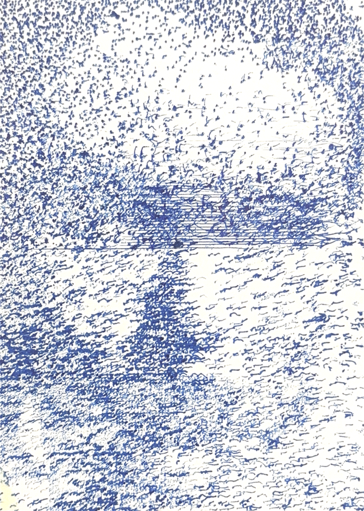
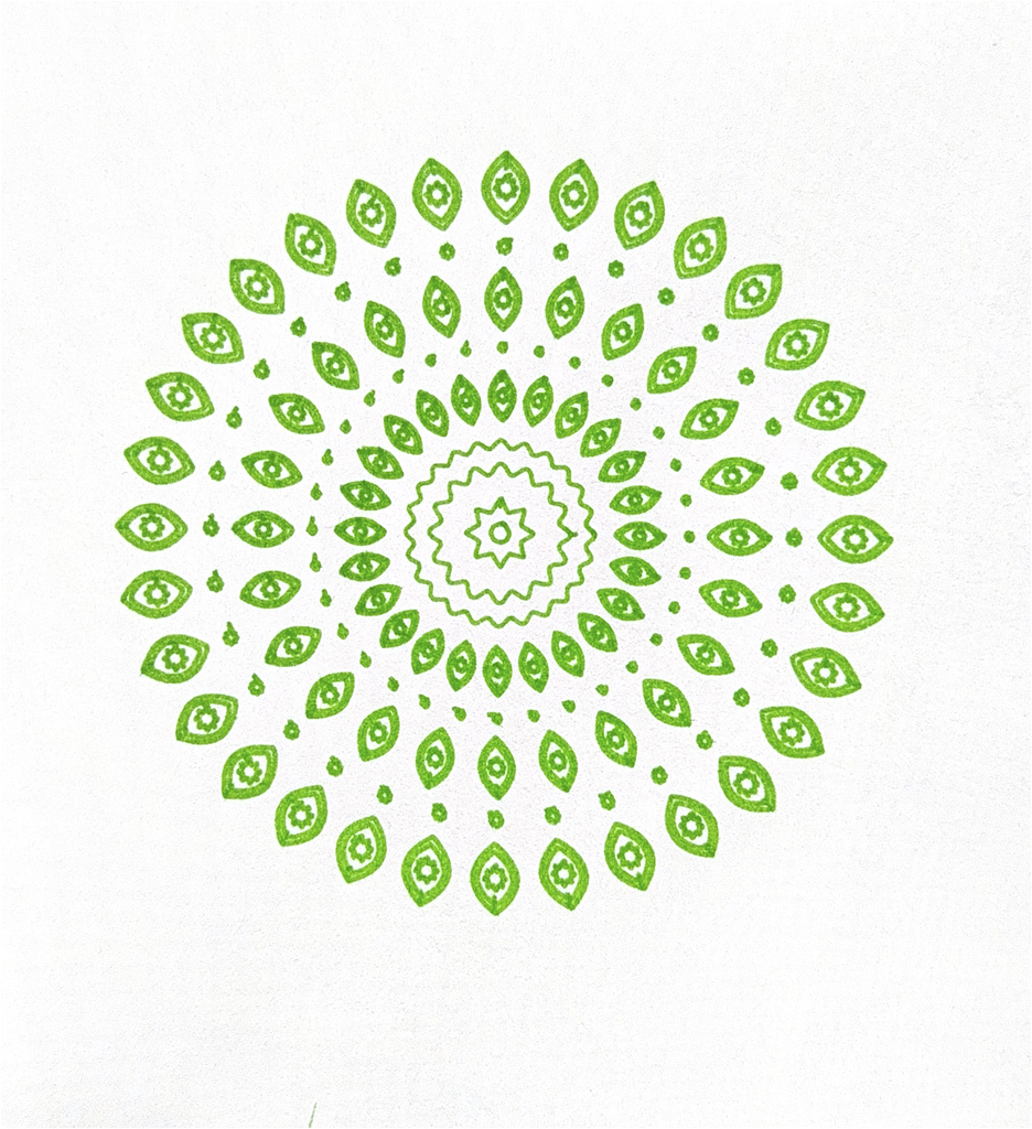
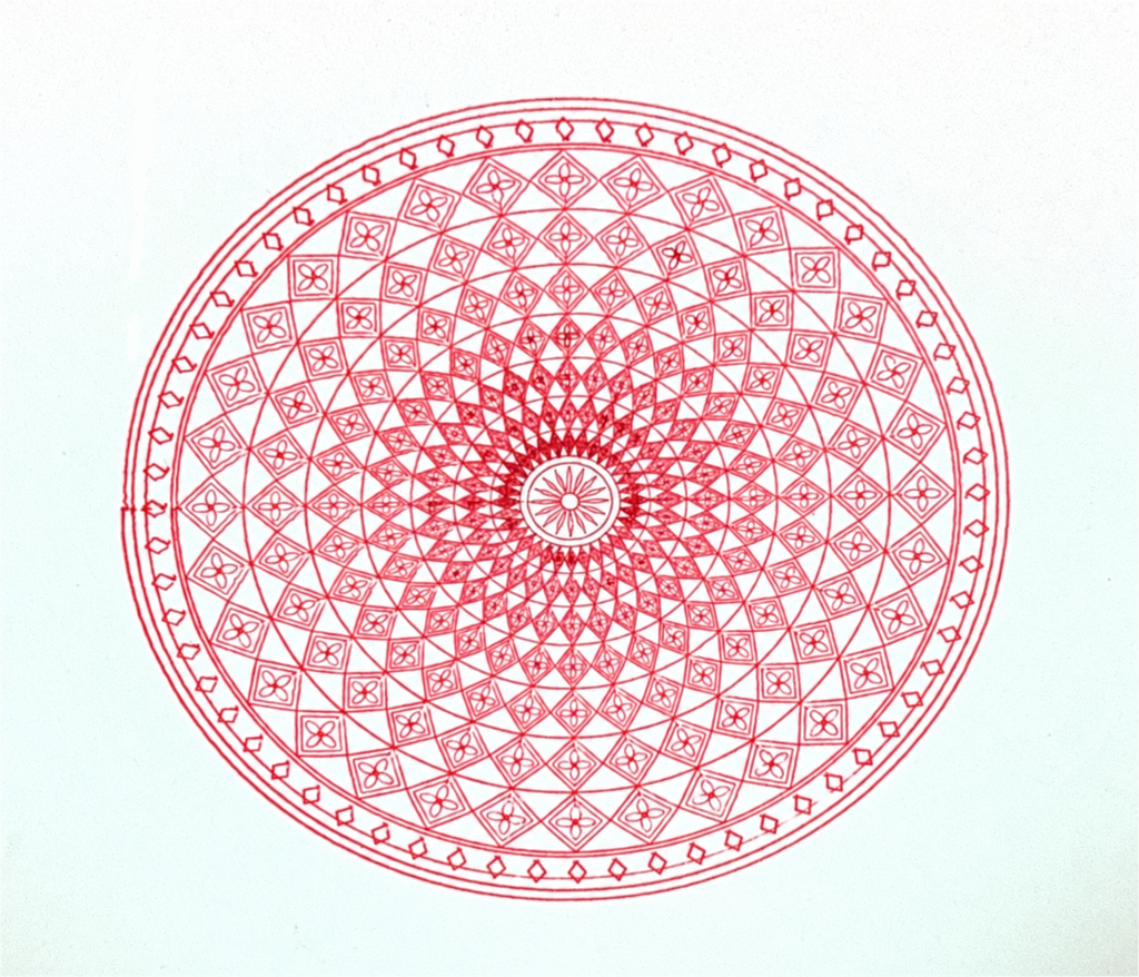
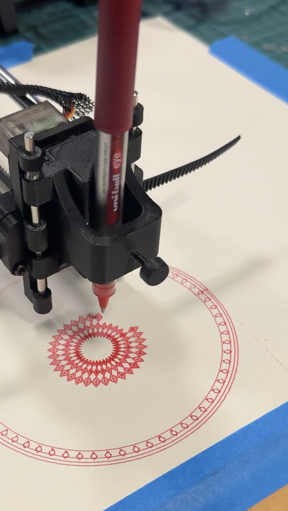
I initially experimented with stippling an artform created purely by dots. I managed to create a face using dots, but the results were inconsistent. In my test, the dots were so densely packed that the image became almost solid rectangle, which helped me understand the importance of spacing and dor density. Leaving white space for the facial features to appear was an important detail I also missed the first time. The plotter also had to lift and lower the pen hundreds of times, making each drawing take around an hour, and thicker pens made the dots merge together. I then completely changed my idea towards Islamic geometric patterns, beginning with a simpler green circular mandala before developing more detailed compositions. My first detailed red mandala faded across part of the page because the plotter was unbalanced; applying pressure to one point of the plotter while it worked on that area improved the contact and the result. The purple star test revealed problems with scale, orientation, and pen height, with the pen dragging across the paper and creating unwanted connecting lines. On black paper, thick gold ink worked well for larger patterns but turned fine details into a dense gold patch, while the thin white pen produced uneven ink and smudging. I also found that, with the materials and pressure I was using, repeatedly passing over the same area more than about five times could damage the paper causing it to rip . These experiments helped me balance detail, spacing, ink flow, and physical pressure.
Below is a breakdown of each experiment and how I revised the experiment to improve my results:
Experiment 1: Stippling: Dots Too Close Together
Experiment: My first stippling test had dots packed so closely together that the face became a nearly solid blue rectangle.
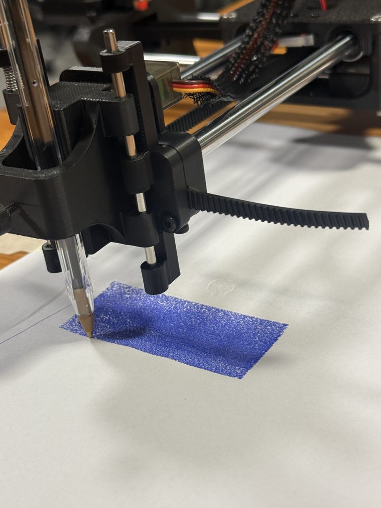
Revision: I increased the spacing and slowed the speed down, also I allowed more white to be visible in the space so the facial features could appear clearly.
Experiment 2: Developing a More Detailed Mandala
Experiment: I started with a simpler green circular pattern to explore repeated shapes and radial symmetry.
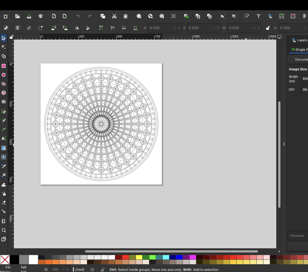
Revision: I developed a denser composition with diamond bands, floral details, and a decorative border. I added more repetition which made the overall design more complex and interesting.
Experiment 3: Plotter Imbalance and Faded Lines
Experiment: When I tried out a more complicated pattern the mandala faded across the lower section because the plotter did not maintain even contact with the paper.
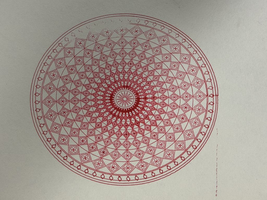
Revision: I applied pressure to one point of the plotter while it worked on that area, which improved the contact. I also slowed the speed down to 3000 to be as precise as possible when plotting the design.
Experiment 4: Drawing Size, Orientation, and Pen Height
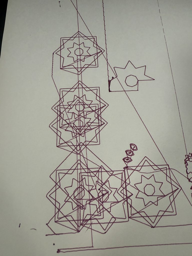
Experiment: The purple star test was too large and incorrectly oriented. The pen also sat too close to the paper, leaving unwanted lines between shapes.
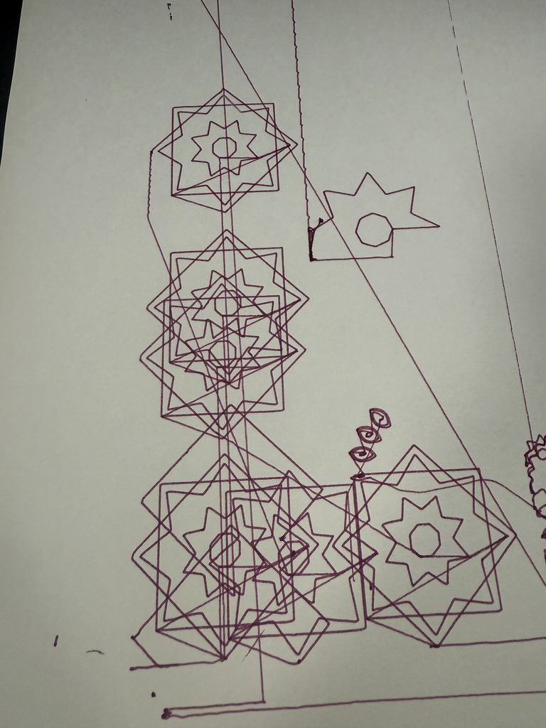
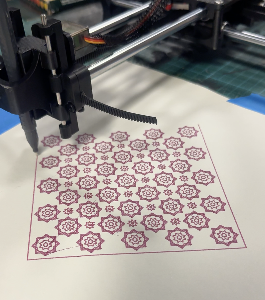
Revision: I corrected the scale, orientation, and pen position before producing the final star composition. I also played with rotation by adding squares on top of each other to make a star shape. Also, instead of creating this in a normal square I rotated it to make a diamond shape and added more details in between the stars.
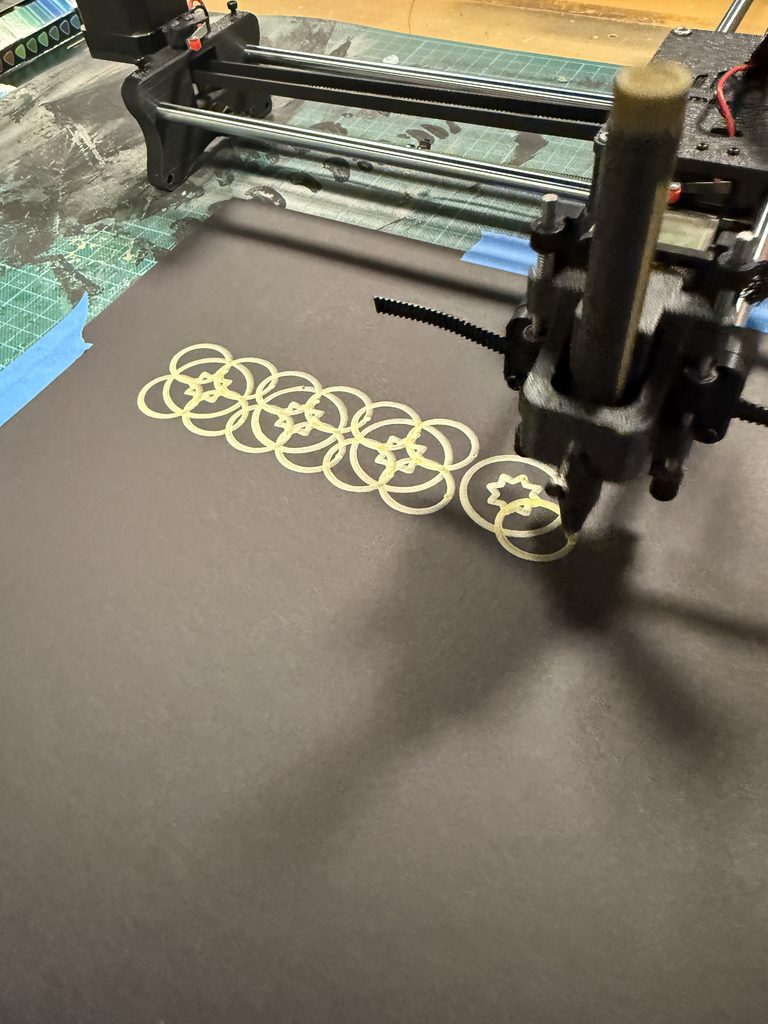
Experiment 5: Thick Metallic Ink on Black Paper
Experiment: I tried a detailed pattern with a thick gold pen on black paper. The ink covered the small shapes and curves and hid all the details. This created a dense gold blob which is not the outcome I was expecting.
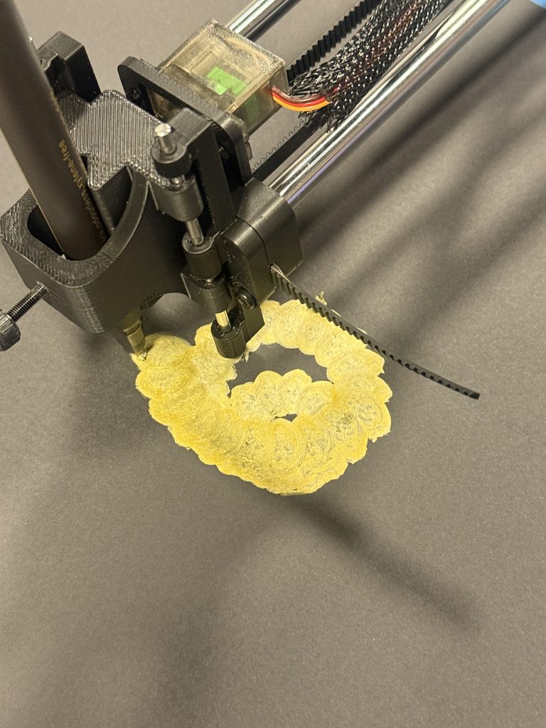
Revision: I used the thicker metallic pen for a larger, more open circular pattern which worked successfully.
Experiment 6: Thin White Ink on Black Paper
Experiment: The thin white pen did not release ink smoothly on the black paper, producing uneven marks and smudging.
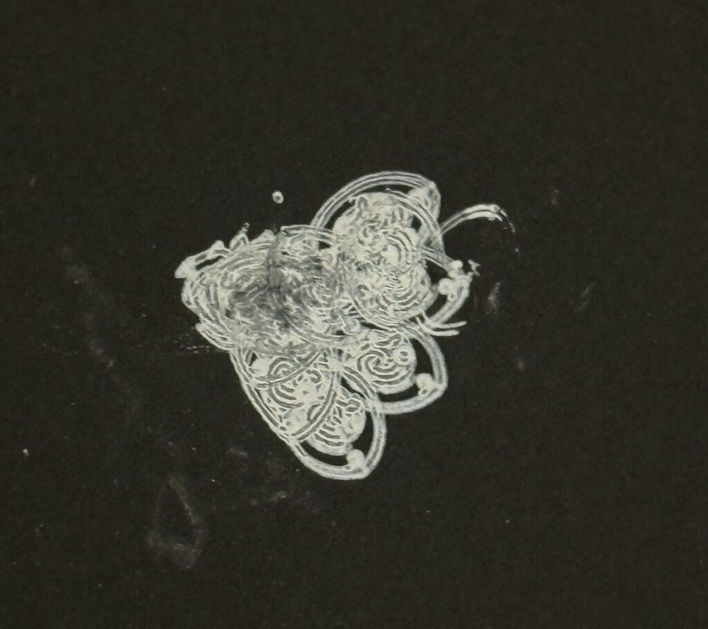
Revision: I moved away from that pen and paper combination and selected materials that produced more consistent lines instead.
Challenges and How I Overcame Them
The main challenge was getting the physical drawings to match the designs on screen. My stippling tests were too dense, so I increased the spacing and left more white space to make the face visible. However, the repeated pen lifts made this process slow and inconsistent, which led me to explore geometric patterns instead. I also encountered problems with the plotter’s balance, drawing size, orientation, and pen height. When part of the red mandala appeared faded, applying pressure to one point of the plotter improved the pen’s contact with the paper. Other tests helped me recognise that thicker pens needed larger shapes and that excessive overlaps damage the paper and causes too much ink to gather in one place and the paper eventually rips. I used these observations to simplify crowded areas and choose pens that suited each design.
My pen plotter did not work reliably because of both software and hardware issues, including a broken Arduino. As a result, I carried out most of my experimentation on Professor Jack’s plotter. Although this limited my access to my own machine, I was still able to test different patterns, pens, and papers and use those experiments to develop my final drawings.
What Went Well
The strongest part of the project was turning simple shapes into detailed patterns through repetition and symmetry. Once I found a suitable combination of design scale, pen, and paper, the plotter produced intricate drawings with clearly defined details. The metallic ink on black paper was especially successful because the contrast made the circular pattern stand out, while finer coloured pens on white paper worked well for the mandala and star composition. Developing the three drawings also allowed me to explore different arrangements while maintaining a cohesive Islamic inspired theme. The experiments helped me make more informed choices, and seeing the patterns move from code to physical drawings was rewarding.
Final Series
My final series consists of three drawings connected by repetition, symmetry, and Islamic-inspired geometric art. The first is is a detailed red circular mandala on white paper, built from concentric bands of diamonds, floral details, and a central flower. The second is a diamond-shaped arrangement of small stars made up of squares in purple ink on white paper, with smaller stars filling the spaces between the larger motifs . The third is a repeating pattern of interlocking circles and squares in metallic gold ink on black paper. Each drawing uses a different structure, but the series remains cohesive through its shared geometric approach, while the changes in colour, paper, and density demonstrate different possibilities of the pen plotter as a drawing medium.
1. A Circle of Harmony
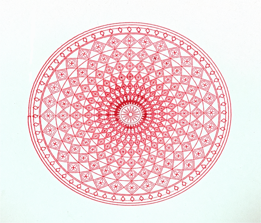
Code Here: https://editor.p5js.org/AsmaAlMurr/sketches/Cgw5wOqID
2. A Mosaic of Stars
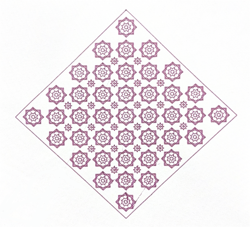
Code Here: https://editor.p5js.org/AsmaAlMurr/sketches/Fg0LKC5va
3. Rings of Repetition
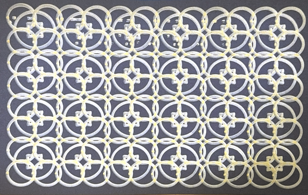
Code Here: https://editor.p5js.org/AsmaAlMurr/sketches/FMLp1fHUp
Critical Reflection
This project changed how I understood the pen plotter. I began by expecting it to reproduce the digital drawing accurately, but the experiments showed that ink flow, pen width, pressure, balance, and paper resistance all influence the final work. Layering added complexity, but excessive overlap could obscure the geometry or damage the surface. Colour also changed how the patterns were perceived: fine coloured lines on white paper emphasised detail, while metallic ink on black paper made the larger shapes more prominent. Applying pressure during the red mandala helped me complete the drawing, but it also showed that the machine still required my observation and intervention; a more stable setup would make future results more consistent. I learned to design for the physical behaviour of the plotter rather than only for the screen. The final drawings therefore reflect both the precision of computational rules and the variations introduced by working with real pens and paper.